Advisor Perspectives welcomes guest contributions. The views presented here do not necessarily represent those of Advisor Perspectives.
Introduction
In April of 2008 I started writing about the miserable stock markets we’ve experienced in this first decade of the 21st century, suggesting that things might even get worse.
They did, and then they got better in 2009, but not good enough to bring the decade into positive territory. We have just experienced the worst U.S stock market decade in the past 8 decades, starting in the 1930s.
In this end-of-year commentary, I examine the past year and the past decade, placing them into perspective relative to the long run history of our stock markets. I discuss both domestic and foreign stock markets.
The U.S. Stock Market

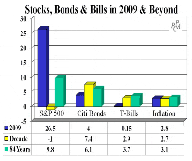
The U.S. stock market, as measured by the S&P 500, earned 26.5% in 2009, rebounding from a 37% loss in 2008. This recovery was not enough to restore previous losses, however, so we’ve ended the decade with an average annualized loss on the S&P of 1% per year, well below the 84-year long term average return of 9.8% per year. By contrast, bond performance for the year (4%) and the decade (7.4%) was in line with historical averages (6.1%), as was inflation (2.8%). Completing the picture, we’re paying the government to use their mattress, with Treasury bills yielding 0.15% for 2009.
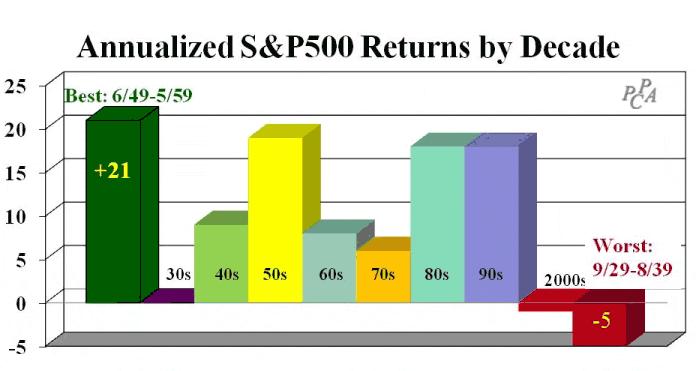
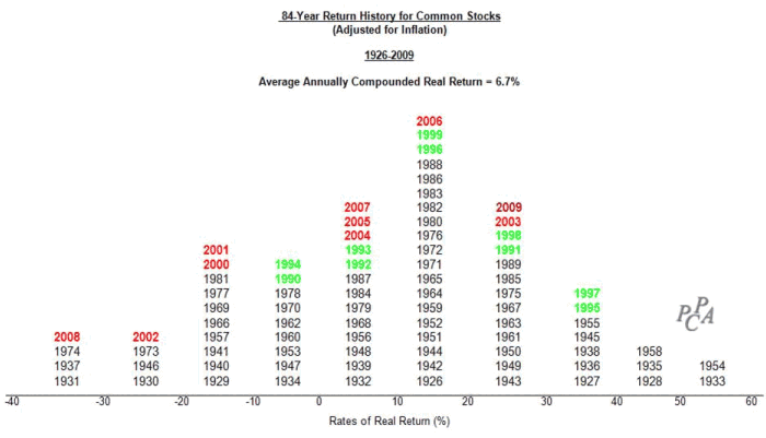
Of the eight calendar decades for which we have data (1930s, 1940s…), the 2000s were the worst performing, although they were not the worst 10-year period ever. The following chart shows the returns of the past eight calendar decades, as well as the best and worst 10-year periods ever. There have been worse times than the 2000s: the S&P lost 5% per year in the 10 years ending August 31, 1939(shown in the graph), and we just experienced the worst real (return net of inflation) 10-year loss in the period ending February 28, 2009 (not shown). Did you feel this February, 2009 loss? That decade brought real cumulative losses of 49%, or 6.5% per year. No wonder we feel poorer. It’s been awful.
Delving deeper into the details, the next graph shows in red how the individual years of the 2000s fared historically. Also, shown in green are the individual years of the previous decade, which as you can see from the graph above was a very good decade. Years like 2008 have happened before, but fortunately not very often; 1931, 1937 and 1974 were the only other years with real losses in excess of 30%. Note also that only three of the past ten years – 2003, 2006 and now 2009 -- were reasonably good. By contrast, you can see how good the green colored 1990s were.
Investors would have been better off in bonds or Treasury bills than in stocks. Do you think the next decade will be better, or bring more of the same? Where can we invest and be safe? One place that would have helped in the past decade was foreign markets, which returned more than 6% per year, although they too suffered 2008 losses.
The ride to disappointment has been bumpy. First the bubble burst in the three years 2000-2002, and from there the stock market clawed its way back so that investors had earned an average 3.5% per year return for the decade-to-date as of October of 2007. We were back even with inflation for the decade-to-date. But then the next 16 months took all of that back, and more, with the S&P plummeting 55% from 11/1/07 through 2/28/09.
As painful as those 16 months were, we can still learn from this experience. This is the kind of period that serves to stress test those investments that are supposed to be good defensive plays, and to evaluate how well our professional investment managers have held up. We’ve made back some ground in 2009, but there are plenty of reasons to not be sanguine. In the following we review various market segments and strategies, to show what worked in the year 2009 and in the decade, and what did not. What sectors, styles, and countries have performed best and worst? The bottom line: everything worked in 2009, and only growth stocks failed for the decade. The real questions of course are all about the future; an understanding of the past should help.
The Year 2009
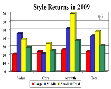
As the exhibit on the right shows, every investment style had substantial gains in 2009. Smaller companies gained more than 40%, exceeding the 24% return to larger companies. Similarly, growth outperformed value, earning 37% versus 29%. The “stuff in the middle” that we call “Core” surprised by underperforming both value and growth, a somewhat unusual occurrence. Our style definitions are mutually exclusive and exhaustive, making them excellent for style analyses, both returns-based and holdings-based. We use Surz Style Pure® indexes throughout this commentary, as described in the Appendix.
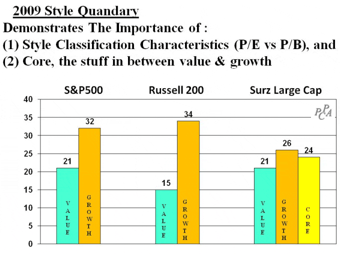
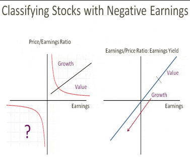
Not all style indexes are created the same. Both the S&P and the Russell indexes disregard core. Also, the classification variables that are used to define styles mattered a lot in 2009. Russell uses the ratio of price to book (P/B) to divide the universe of stocks into value and growth1. High P/B is growth and low P/B is value. The idea is that a stock trading at a price near or below its cost basis is inexpensive, a good value. But as Laurence Siegel [Siegel, 2003] states in a CFA Research Foundation monograph “Book value is mostly a historical accident. It is the accounting profession’s estimate of the company’s value; it reflects what the company paid for assets… [and] includes the goodwill of companies acquired.” By contrast the Surz Style Pure® indexes combine Price/Earning (P/E), dividend yield and Price/Book (P/B). The result is that many financial companies with negative earnings and falling prices are classified as growth by Surz but value by Russell. The rationale for viewing stocks with negative earnings as growth is provided in the exhibit on the right where we use the reciprocal of P/E, also known as the earnings yield. The rationale for Price/Book classifying troubled financials as value is that prices had fallen.
The result of these differing views is shown in the next exhibit.
All three style families agree that large growth stocks outperformed large value, but the degree of outperformance ranges from a 1,900 basis point spread for Russell to a 500 basis point spread for Surz Style Pure®. These differences are caused by Surz Style Pure®’s inclusion of core and its use of a three-factor classification approach that views stocks with negative earnings as growth stocks. It matters a lot which barometer you use to evaluate performance in 2009, especially for large growth stocks.
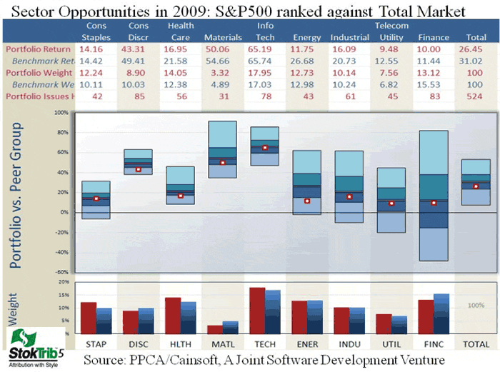
On the sector front, every sector had gains in aggregate, but it was certainly possible to lose money in several sectors. In the exhibit below, we show the range of portfolio opportunities available in each economic sector by using a simulation approach that creates portfolios at random, selecting from stocks in each sector. We call this approach “Portfolio Opportunity Distributions” (PODs). As you can see in the exhibit, Information Technology was the best performing sector for the year, earning 63% (middle of the “Info Tech” floating bar), while utilities was the worst sector with a 14% return. But note the ranges of the floating bars. Financials had a lot of opportunities, i.e. a large spread in portfolio returns, while consumer discretionary was quite narrow. Note also how the S&P500 performed in each sector (red dot), near median in most, but underperforming in energy, where smaller companies fared best. Note also the sector weighting differences in the bottom of the graph. You can use this exhibit to dissect your own performance.
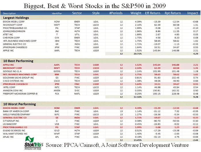
The S&P portfolio of 500 large companies underperformed the broad market of roughly 5500 stocks in 2009, earning 26.5% versus the total market’s 31% return. Yes the S&P is a managed portfolio; it’s just managed by committee. A closer look is revealing. The following exhibit shows the biggest, best and worst stocks in the S&P during 2009. See some companies you recognize?
1 Russell also uses forecast earnings growth, but the Price/Book ratio is the dominant characteristic.
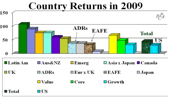
Moving outside the US, it was possible to double your money. Foreign markets fared much better than the US in 2009, earning 45% versus our 31%. Latin American stocks returned a sensational 108% in the year, and every country except Japan outperformed the US, so some will say that diversification “worked” in 2009, vindicating portfolio theory. In the aftermath of the 2008 catastrophe many lamented that diversification didn’t work when you needed it most because everything tanked at the same time. Nothing works all the time, and diversification doesn’t promise better performance, just greater stability of returns. It is indeed a world market, and owning more than just US companies was beneficial in 2009.
The Decade of the 2000s
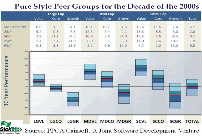
Annual reporting season will start soon, and this is one of those unfortunate times when consultants and investment managers will try to console their clients by explaining how their pain is less, hopefully, than most others. Based on our analysis, the average US stock fund eked out a modest 0.1% per year gain during the past decade. It was a decrepit decade.
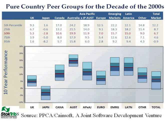
The good news, however, is that much of the pain was limited to just the growth sectors of the market. This will be particularly awkward and delicate for growth stock managers, and is likely to bring forth the difficult question about the superiority of value investing. As for value and blend (or core) managers, they should have delivered positive returns for the decade, with smaller value stocks delivering double digit returns. In other words, style effects are extremely pronounced and important for evaluating long-term performance. The old saw that value and growth perform about the same over the long run does not apply to the past decade. Similarly, there was a wide spread of country results during the decade, with Japan losing 2.8% per year while Australia & New Zealand delivered 20% returns.
So here’s my prediction of what evaluators like Morningstar will proclaim: growth stock managers were more skillful than value managers during the decade because the majority of growth stock managers outperformed their benchmarks, while the majority of value managers lagged their benchmarks. This is poppycock caused by a peer group flaw known as classification bias. Peer groups are terrible backdrops for evaluating performance. That’s why we provide you a better way in the next two exhibits, which you should note are being published here many weeks before the “real” results are available (see the release date at the top of this commentary).
The universes in these exhibits are created using an unbiased scientific approach called Portfolio Opportunity Distributions (PODs). They represent all of the possible portfolios that managers could have held when selecting stocks from the indicated markets. Traditional peer groups are very poor barometers of success or failure because of their myriad biases. Everyone knows that it’s easy to find a peer group provider that makes you look good, but for some reason the industry tolerates, even condones, this deceptive practice. For this reason, the new “Trust but Verify” is focused on the spin rather than the accuracy of the reported return [see Surz 2009]. As Professor Meir Statman [Statman, 2004] states in his article entitled “What Investors Want”: Today’s money managers say they compete with other money managers by generating the highest alpha. They denigrate the role of marketing. Yet each money manager has ready stories about other money managers with low alphas who snatched clients through clever marketing.
Now is the time to stop the subterfuge, because we can. PODs are bias free and are therefore a much more reliable performance evaluation backdrop, plus they’re available now, many weeks before the “real” biased peer groups. David Loeper, Chairman/CEO and Founder of Finance Ware and Wealth Care Capital Management, expresses the following consternation: It escapes me why so many wait for biased and inaccurate, or at least misleading, universe data when they can get unbiased data almost immediately following any calendar quarter or month.
You can use the charts below to get an early and accurate ranking of your own portfolio -- just plot your dot. It’s our gift to you in this holiday season.
Help us help you
This commentary incorporates several innovations that you can use right now in this important annual reporting season, including:
• Surz Style Pure® Indexes
• StokTrib holdings-based style analysis and attribution that gets the benchmark right
• Portfolio Opportunity Distributions
Surz Style Pure® indexes are available for free on a number of platforms including Evestment Alliance, MPI, Zephyr, Factset, Informa, SunGard, Pertrac, Morningstar, and others. Please use them, especially for returns-based style analysis because they meet Dr. William F. Sharpe’s recommendation to use a style palette that is mutually exclusive (no stock is in more than one style) and exhaustive (the collection of indexes comprise the entire market). The good news is that Surz Style Pure® indexes are free – a free upgrade is just mouse clicks away. Get the most out of your returns-based style analysis investment; compare and contrast your index choices.
We’ve invited the service bureaus above and others to incorporate our advanced attribution and universe approaches, and most agree that ours are important and meaningful innovations, but there is little business motivation for these vendors because their clients are not requesting these services. So here’s how you can help us help you. Please ask your service providers to add these tools to your toolbox. It costs nothing to ask, and the rewards are more informed decision making that will set you apart. The old tools, namely indexes and peer groups, are incapable of performing the basic task of separating winners from losers. And attribution analysis that uses the wrong benchmark leads us to mistaken inferences about the reasons for success or failure. If the benchmark is wrong, all of the analytics are wrong, wasting our time, energy and money.
Far worse, we make bad decisions.
These shortcomings open the door for creative salespeople to turn mold into gold right before our eyes. The Madoff mess was made possible by complacency and laziness in manager due diligence.
Please ask your service providers to add these important innovations, and let us know how we can help you help yourself in this endeavor. Thanks.
A word about the old folks
Many retirees, as well as those who are saving for retirement, have invested in target date funds. Target date funds start out aggressively when the target date is distant and then become more conservative as the target date draws near. The target date fund (TDF) industry is growing rapidly. Currently encompassing $310 Billion, this industry is forecast to grow above $2.5 Trillion in the next 10 years [see Casey, Quirk 2009], primarily because it has become the preferred qualified default investment alternative (QDIA) under the Pension Protection Act of 2006.
TDFs are a reasonably good idea, but suffer from pathetic execution, at least so far. This is due in large part to the fact that most TDFs are currently designed to serve beneficiaries beyond the target date, to death, instead of to their presumed target – the retirement date. Such funds have come to be known as “THROUGH” funds, as contrasted to “TO” funds which are designed to end at the target date. A secondary issue with TO funds is the amount of equities that should be held at the target date; we believe zero is the correct answer because savings are most dear as retirement draws near.
2008 was disastrous for TDFs, with the typical 2010 fund losing 25%, because it held 45% in equities. 2010 funds are intended for those retiring between 2005 and 2015. We should have learned a lesson from 2008, but little has changed other than it is likely that the SEC and DoL will require fuller disclosure, especially about the meaning of the date in target date fund names. Perhaps THROUGH funds will have to be called target death funds.
With the recovery in 2009, some have begun to argue that even TO funds should have higher, rather than lower, equity allocations at target date because participants will be richer. For example, [Basu 2009] argues that a glide path that increases equity exposure through time dominates the traditional glide path, which has decreasing equity exposures. According to Basu, this “Contrarian” path delivers greater ending wealth 90% of the time, with about the same risk, leading to a characterization called “Almost Stochastic Dominance” (ASD). ASD means the Contrarian path is better most of the time in both risk and reward. The flaw in this perception is that risk is measured without regard to account size, so losing 10% of a $10 portfolio early on in the glide path is no different than losing $100,000 on a $million portfolio as the glide path matures. We correct this mistake in this commentary, and reach a totally different conclusion. There is no free lunch in target date investing. After all, who would advise their clients to be entirely in equities as they enter retirement?
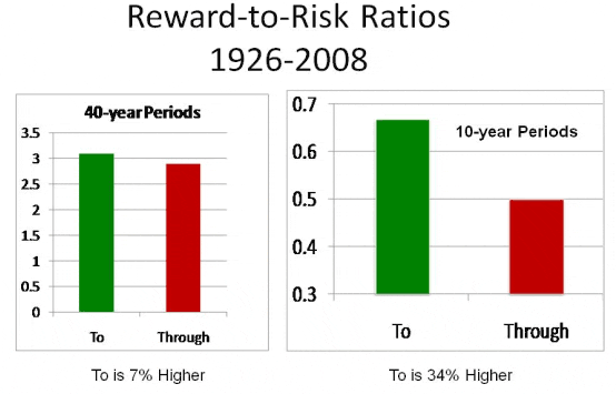
An important question for fiduciaries is what are the risk and reward trade-offs of “through versus to” TDF paths. To answer this, we have measured ending wealth and risk for all 40-year glide paths going back to 1926. Importantly, the risk measure is dollar-weighted downside deviation, which we call “risk of ruin.” The rationale for this measure of risk is provided in [Surz 2009]. The following graph summarizes the results.
As you can see, the reward-to-risk is about the same for the complete 40-year glide path, but TO funds dominate over the critical last 10 years of the path. So now you know the risk and reward considerations in your choice between TO and THROUGH – although both provide roughly the same reward-to-risk profiles over the full 40 years, “TO” funds are much safer over the final 10-year period as the target date approaches.
Conclusion
Returns in 2009 were good year, but it was one of only three good years in the past decade. U.S investors broke even on average during this decrepit decade, unless you were concentrated in the growth stock segment of the market, where most losses occurred. Even though growth outperformed value in 2009, it underperformed for the full decade, losing 8% per year while value stocks grew at 7% per year. This will make it difficult for growth stock managers to retain business because investors routinely confuse style with skill, and academics assert intrinsic superiority to value investing. It wasn’t that long ago that growth stock managers benefitted from investors’ style-skill dyslexia as the growth bubble inflated. What goes around comes around. Do not confuse style with skill; custom benchmarks can help. Style rotation is a separate and distinct decision from the active-passive decision.
Diversifying outside the U.S. has helped, with every country except Japan outperforming the U.S. in the past decade. Some will say diversification has “worked” because exposure to foreign markets improved returns, but that is not the promise of diversification. In theory, diversification improves the reward per unit of risk – it smoothes out the ride.
Defined contribution plan fiduciaries have come to believe that any target date fund will suffice because all target date funds are qualified default investment alternatives (QDIAs). But there are huge differences among target date funds, especially near the target date, so this generic belief is false. Fiduciaries have the responsibility to select and monitor good target date funds. In particular, convenience and familiarity are foolish reasons for entrusting employee savings to the plan’s recordkeeper.
Ron Surz is President of PPCA Inc at www.ppca-inc.com and its subsidiary Target Date Solutions at www.TargetDateSolutions.com
REFERENCES
Basu, Anup and Michael Drew, “Portfolio Size Effects in Retirement Accounts: What Does it Imply for Lifecycle Asset Allocation.” Journal of Portfolio Management, April 2009
Casey, Quirk & Associates, “Target Date Retirement Funds: The New Defined-Contribution Battleground”. November 2009 Research Paper
Siegel, Laurence B. 2003. Benchmarks and Investment Management. Research Foundation of CFA Institute, Charlottesville, Va. Available online as a free download at http://www.cfapubs.org/doi/pdf/10.2470/rf.v2003.n1.3922
Statman, Meir. “What Do Investors Want?” Journal of Portfolio Management, 30th Anniversary Edition 2004, pp. 153-161
Surz, Ronald J., “Should Investors Hold More Equities Near Retirement, or Less?” Advisor Perspectives, August 2009. Available on line as a free download at http://www.advisorperspectives.com/newsletters09/Should_Investors_Hold_More_Equities_Near_Retirement.php
-------------,”The New Trust but Verify.” PPCA White Paper, November 2009. Available for free download at http://www.ppca-inc.com/pdf/Trust-But-Verify-20091123.pdf
APPENDIX: Surz Style Pure® Indexes
Style groupings are based on data provided by Compustat. Two security databases are used. The U.S. database covers more than 6000 firms, with total capitalization exceeding $18 trillion. The non-U.S. database coverage exceeds 15,000 firms, 20 countries, and $31 trillion -- substantially broader than EAFE.
To construct style groupings, we first break the Compustat database for the region into size groups based on market capitalization, calculated by multiplying shares outstanding by price per share. There are 3 regions maintained in our system: U.S., Foreign and Global. Beginning with the largest capitalization company, we add companies until 65% of the entire capitalization of the region is covered. This group of stocks is then categorized as "large cap" (capitalization). There are generally about 200 companies in this group for U.S., 800 for Foreign, and 1000 for Global. The second size group represents the next 25% of market capitalization and is called "mid cap". There are generally about 1000 companies in this group for U.S., 2700 for Foreign, and 3500 for Global. Finally, the bottom 10% is called "small cap". There are generally 5000 U.S. securities in this group, 10,000 Foreign, and 15,000 Global.
Then, within each size group, a further breakout is made on the basis of orientation. Value, core, and growth stock groupings within each size category are defined by establishing an aggressiveness measure. Aggressiveness is a proprietary measure that combines dividend yield and price/earnings ratio. The top 40% (by count) of stocks in aggressiveness are designated as "growth," while the bottom 40% are called "value," with the 20% in the middle falling into "core."
Read more articles by Ron Surz