Advisor Perspectives welcomes guest contributions. The views presented here do not necessarily represent those of Advisor Perspectives.
The world is in constant need of a refresher course on the obvious.
James Picerno, Author.
As I rang in 2011, I found myself in awe of how quickly time had passed and how much things have changed. The 1968 movie “2001: A Space Odyssey” caught our fantasy as a journey into the distant future, yet here we are a decade beyond 2001 (and more than 40 years after the movie came out). And who ever thought Dick Tracy’s two-way audio-visual watch could ever exist outside a comic strip, or that 3-D color TV’s would hang on walls like paintings? Transporters and holodecks1 can’t be far behind.

The investment profession has also been on an odyssey: a quest for truth, spurred by the recent financial crisis. The truth was easier to grasp before investing became so complicated and challenging, due to the unique combination of quantitative easing, bank failures, the mortgage crisis, and other events. The recent lessons we’ve learned about excesses and fraud, especially those of 2008, have not yet been entirely digested, yet they should certainly not be forgotten.
So in this end-of-year commentary, I review some of those lessons with an eye to the truth so we can benefit from them in the future. But before I bring us back to that painful 2008 and what has happened since, let’s review the year 2010. I then discuss 2008’s lessons, and conclude with my traditional review of the longer-term history of U.S. markets over the past 85 years, the longer odyssey.
The year 2010 in review
I’ve been writing these commentaries for 10 years, and this year I’ve decided to do something entirely different that will lead into the discussion of the odyssey of investment truths. I’ll review the year by analyzing why popular indexes, namely the S&P500 and the EAFE, performed as they did. I provide attribution analyses set against a backdrop of the entire market. Prepare for a “deep dive.”
The US stock market
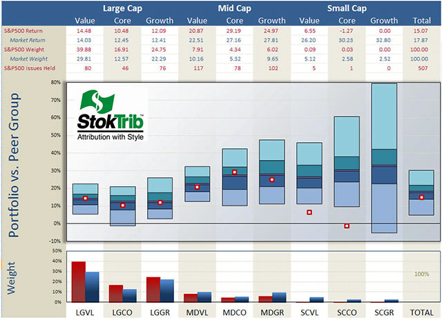
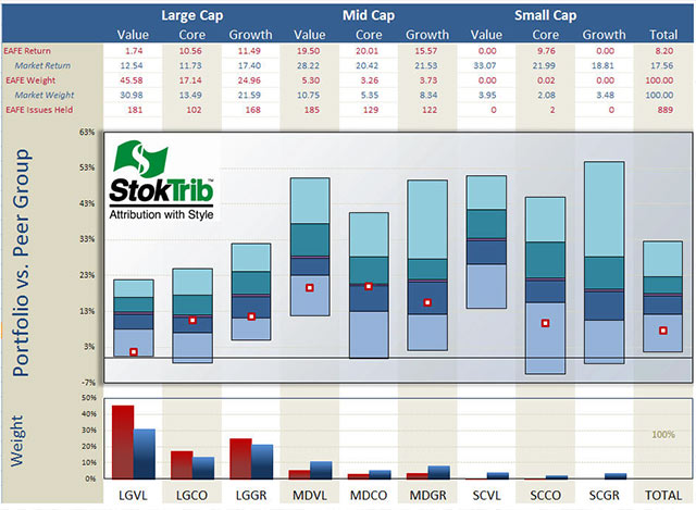
We begin with an analysis of the style composition and performance of the S&P500, as shown in the next exhibit.
The portfolio in the exhibit is the S&P500 index and the benchmark is the entire U.S. stock market, as provided by Compustat. Let’s begin with a discussion of the style make-up of the S&P as shown in the bottom of the graph. Unsurprisingly, the S&P has a large-company orientation, especially tilted toward large-value companies. The total market is about 30% large-cap value, whereas the S&P is 40% large-cap value.
Throughout this commentary I use Surz Style Pure® indexes, defined at Style Definitions.
This large-company orientation hurt the S&P because smaller companies performed better in the year, as shown by the middles of the floating bars in the center graph. These floating bars represent pure scientific peer groups described at Portfolio Opportunity Distributions (PODs). The median of each POD is the return for that style in aggregate and the ranges are the return opportunities for that style. As you can see, smaller companies returned in excess of 25%, with small-cap growth leading the way with a 33% return, while larger companies lagged with returns in the low teens. Large-cap value in particular returned 14%. It was primarily this concentration in large-value companies that caused the S&P (15%) to lag the total market (18%) in 2010, as shown in the far right table and floating bar. In other words, allocation to styles penalized the S&P relative to the total market in 2010.
The other component of attribution is stock selection, which we can see in the location of the dots in the exhibit. For the most part, the stocks selected by the S&P committee performed near their respective medians within each style, with the exception of smaller companies, which didn’t matter much because the allocations were minimal.
You can use this exhibit to rank individual managers within styles, as well as rank their style components. Just plot your dots in the graph above. For example, locate your manager’s style in the exhibit (large value, small growth, etc.), and place his rate-of-return within the corresponding floating bar, using the scale on the left and the median from the table above as your guide. Voila, an accurate ranking.
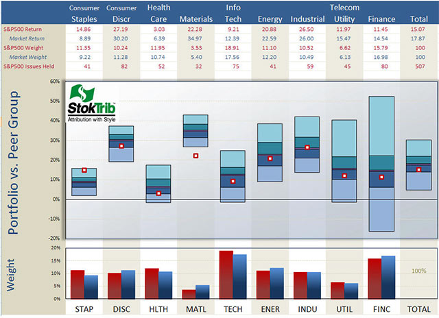
Next, I performed a similar analysis, decomposing the S&P by economic sector, and concluded that stock selection hurt performance. But how can that be in light of what I just concluded in the previous paragraph where stock selection was not a factor? Sector allocations of the S&P are in line with those of the total market, mainly because the S&P is a large part of the total market. What we’re seeing in the next exhibit are the style impacts on performance within economic sectors: style effects manifest themselves as stock selection when the S&P is decomposed by sector.
The lesson to be learned here in our odyssey is that we need to be careful to evaluate skill rather than style. An attribution against the S&P500 by sector can be easy in some sectors and difficult in others if the S&P is not the correct benchmark. For example, a manager with a broadly diversified portfolio will have a return on Materials that is close to the 34.97% shown for the total market in the table below. This is 13% greater than the S&P’s 22.28% return in Materials, which would appear to be a big success, and it would be a big success if the S&P were the correct benchmark, but in this hypothetical we’ve said that the manager is more broadly diversified than the S&P, so the outperformance is most likely caused by style (i.e., being broadly diversified) rather than good stock picking.
The performance attribution puzzle is complicated, but well worth the time and effort to get it right. Because it tells us why performance is good or bad, attribution is a window into the future. We want confidence in the manager’s strengths, and comfort that failures are being addressed and corrected.
1. In the Star Trek TV and movie series, the holodeck was a recreational deck on board the starship Enterprise where the crew could enjoy interactive fantasies/plots with holographic sets and characters. It was a virtual reality playground.
Follow the “dancing balls” in the exhibit on the preceding page. The S&P’s only “success” (i.e., performance above the median of the broad market) was in Consumer Staples. It lagged in every other sector, especially Materials, although that allocation was small. The most harmful shortcomings were in Technology and Financials because of their significant weights. Note the middles of the floating bars; Consumer Discretionary and Materials performed best in the year while Healthcare and Consumer Staples performed worst. And also note the ranges of the bars, with Financials exhibiting a wide range of opportunities, reflecting the volatility within that segment of the market; where there’s risk there’s opportunity.
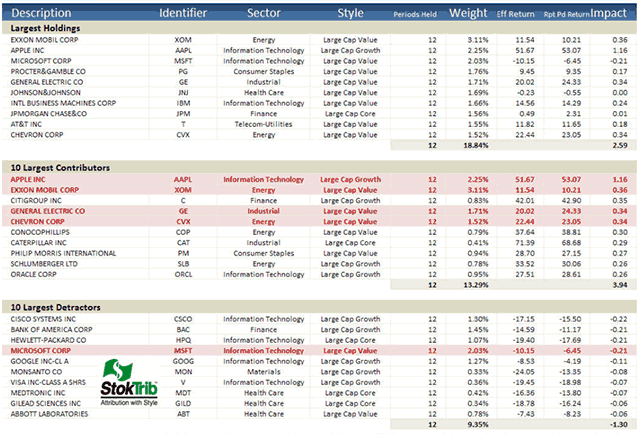
In addition to this attribution, it’s helpful to understand performance at the individual stock level as shown in the following “Biggest, Best, Worst” exhibit.
Here are some observations from this table. Exxon Mobil was the largest holding in the S&P, representing over 3% of the index on average in 2010. The top 10 holdings comprise 18.84% of the index, reflecting concentration in this 500-stock portfolio, because an equal weighting would have just 2% in the top 10. As indicated by the red highlights, four of the top 10 holdings were the biggest contributors (largest positive “Impact,” defined as return times commitment) for the year, and one of the top 10 was among the largest detractors; these are likely to be the same winners and losers that you’ll find in your large-cap managers’ portfolios. The “effective returns” for these holdings are close to their “report-period returns,” indicating relatively constant weights throughout the year. “Effective return” is a performance attribution breakthrough described here. It measures the allocation-weighted return on a stock, and therefore captures the combined effects of stock performance and manager allocation decisions. Effective return is greater than the traditional holding period return if allocations are advantageous, holding more of the stock when performance is good than when it is bad. Of course the reverse is true if allocations are disadvantageous.
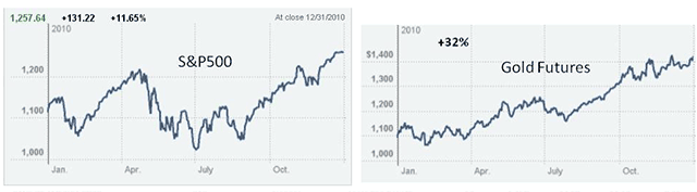
We dodged a bullet in 2010. At mid-year it was looking like 2010 was going to be a big fat letdown, but the last half of the year brought a nice recovery. In the meantime, gold, a current hot topic, continued its upward progression throughout the year. Gold was less volatile than U.S. stocks. (Graphs courtesy of the New York Times)
The non-US stock market
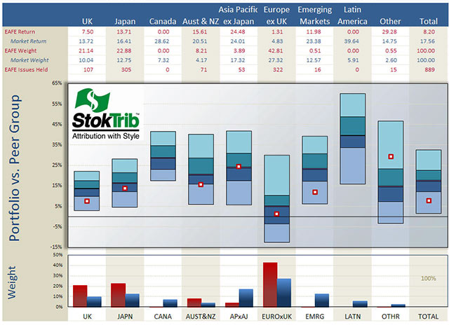
Now let’s turn our attention outside the US, where the total foreign market earned 17.5%, in line with the total US market’s 18%, but the Europe Australia and Far East (EAFE) index substantially lagged the total foreign market, earning only 8%. The following exhibit shows that, like the S&P, the EAFE index is large-company oriented, and this orientation was not in favor. Small-to-mid (“Smid”) cap value was in favor outside the US. However, unlike the S&P, stock selection within styles was poor. This is due to the country allocations of the EAFE. In other words, the EAFE suffered a double whammy: both style and country allocations were out of favor in 2010. The EAFE’s large-value orientation was out of favor, as was its overweight in Europe-ex-UK, and its absence from Latin America. Like the U.S. graph, this graph can be used to rank your foreign managers.
As shown in the following exhibit, Europe-ex-UK was the worst performing region, and EAFE was overweight this region. The index was also void Latin America, the best performing region.
The performance of the EAFE index can be decomposed as follows:
EAFE performance in 2010
Total Market: |
17.6% |
EAFE large company orientation: |
-3.1% |
EAFE country composition: |
-6.3% |
EAFE Return: |
8.2% |
An odyssey, seeking investment truths
The year 2008 brought us two painful lessons: the Madoff crime (see Madoff Prescription) exposed our vulnerabilities to trusted bandits, and we suffered the free-fall in value of almost every asset type as the mortgage crisis snowballed into deleveraging around the world. Madoff should have led us to heightened due diligence, but it has not. The market crash has investors concerned about “Black Swans” and searching for new portfolio constructs.
I begin by discussing what can be done to improve due diligence, a very important aspect of investing and consulting. Then moving on to lessons from 2008’s losses, I discuss portfolio structure and pension investing, namely target date funds. Most advisors focus on asset gathering and relationship building, which is important to growing the practice. In the following, I shift focus to the quality of advice, which in the long run is the key to survival. Let’s resolve to deliver the best advice we can in 2011.
Heightened due diligence
For the most part, client-facing advisors trust others to screen investment managers. It’s time for these advisors to question their trust and to demand an understanding of how the two key due diligence questions are being addressed:
- What does this manager do?
- Does this manager do it well?
The first question is usually answered by on-site visits to the investment firm, supported by analytics like style analysis. It sets the stage for the second question and provides a potential stopping point. If we don’t understand what the manager does, we pass and move on – we don’t invest. Madoff reinforced the importance of this discipline.
As for the analytics, style analysis is only as good as the indexes that are used to identify style, and holdings-based analysis provides the most accurate perspective. According to Dr. William F. Sharpe, the recommended indexes are mutually exclusive and exhaustive, which means no stock is in more than one index and the collection of indexes comprise the entire market. Russell and S&P indexes do not meet these criteria.
The Test for Question 1: Does your due diligence provider use style analysis? Is it returns-based or holdings-based? Are the style definitions mutually exclusive and exhaustive (hint: there are only two index families with these properties)? Do you receive style analysis reports? If you’d like to see an example of holdings-based analysis, you can enter your own portfolio holdings into the portal at StyleScan; there’s no charge for this education.
The second question regarding manager competencies is rarely addressed correctly. It’s not just an opinion and it’s not an easy question to answer, but it is the main purpose of due diligence. The researcher should be determining whether the alternative of passive implementation would do just as well as this manager after fees. We can replicate just about any investment strategy with passive inexpensive blends of mutual funds or ETFs. This second question is best addressed with hypothesis testing and modern holdings-based attribution analyses. Peer groups and indexes do not work – never have, never will. See Better Evaluations for superior alternatives to indexes and peer groups.
The Test for Question 2: Does your due diligence provider use peer groups and indexes to evaluate performance? If so, you and your clients are relying on luck to screen managers, because it’s certainly not science. How confident is the provider in the talent of each approved manager? How much better have these approved managers performed above a passive implementation? Why have approved managers succeeded and why are they likely to continue to do so? If the answers sound like the benchmarks might be wrong (e.g. “this manager succeeds because he’s smaller company oriented”), there is a good chance the benchmarks are wrong. It’s easy to get the benchmark wrong, and difficult to make good decisions when we do.
These tests of faith need to be acted upon now rather than later. There are better researchers using better tools, and amazingly they are lower priced than the “standard” brands you are likely using now. Don’t trust the brand.
Better portfolio construction
Investors have a renewed interest in portfolio construction, due in large part to the current crisis, so core-satellite investing is regaining popularity. Both Vanguard and Putnam recently announced the addition of “core” products to their suite of funds.
So why the interest in core? It could be for either of two reasons: ballast or diversification. Some view core investing as a hedge against making active manager mistakes; core is ballast to keep the investment ship steady. The best core for this purpose is the entire market, like the Wilshire 5000, although the most popular choice is the S&P500. In other words, the most common core portfolio is a reflection of a lack of confidence in active managers. The fact is that all-passive may be the best approach if you distrust active management.
By contrast, the original core idea was to diversify while simultaneously encouraging active managers to give it their best shot. See Centric Core for more details. The original core concept emerged from confidence in active managers, rather than concern about making mistakes, so it was a completeness fund that complemented active value and growth managers by adding what they are not – the absence of value or growth. The absence of value or growth is the stuff in the middle that neither value nor growth managers hold. “Core” in this context means “center.” This provides license for the active managers to be undiversified, concentrating in their areas of expertise. This concept, introduced in the 1980s, gave way to style-based equity specialists and has evolved into an insistence on style purity today. There is a premium placed on adherence to style, and a corresponding necessity to fill in the void left in the middle between value and growth.
Centric core completes multiple manager portfolios, filling in a void, and centric core frequently performs differently than either value or growth, similar to the way mid-cap performs differently than large or small. Traditional core-satellite investing uses a version of core that overlaps the satellite managers, diluting their decisions. By contrast, a centric core that is between value and growth complements the satellites, and delivers the same diversification as traditional core with about one-fourth the allocation.
Target date funds
Target date funds (TDFs) are the most popular qualified default investment alternative (QDIA) in 401(k) plans. The concept of reducing risk as the retirement date grows closer is solid, but the actual implementation has been pitiful as evidenced by the failure in 2008 of most TDFs to defend against principal loss. The typical 2010 fund lost 25% in 2008, surprising just about everyone except the fund companies who provide TDFs. Until now, fund companies, rather than fiduciaries, have set unrealistic objectives that call for high equity exposure, resulting in high fees. The objectives of managing longevity risk or replacing pay cannot be taken seriously in a one-size-fits-all TDF because TDFs have no influence on, or relationship to, mortality or savings. These objectives are better suited for individualized managed accounts. Confirming this absurdity, these objectives are never stated in disclosure documents like fund factsheets and prospectuses because they are hopes rather than objectives. An objective without a viable plan of action is merely hope.
Fiduciaries need to take back control of TDFs by setting objectives that can be realistically achieved, like the following:
- Deliver at least accumulated contributions plus inflation at the target date. Strive to achieve this objective with high conviction (i.e. low risk). In other words, don’t lose money.
- Grow assets as much as possible without jeopardizing the primary preservation objective. Focus on this objective when the horizon (the time to the target date) is long, but sacrifice growth for safety as the target date nears.
The investment policies for achieving these objectives stand far apart from current industry practices. Critically, the preservation objective demands a real* “to” (accumulation-only) fund that ends at the target date entirely in inflation-protected assets, like TIPS and T-bills. By contrast, the TDF industry offers 20-70% in equities at the target date. Even 20% in equities is too risky when preservation is the objective – preserve and protect at the target date.
The next issue is who needs to act first. For the most part, plan sponsors rely on their advisors for choosing TDFs. But advisors have business risk in recommending anything newer or smaller, even if it is better. So the demand for better products needs to start with sponsors directing advisors to open up and seek improvements. Alternatively, advisors could muster up the courage to bring better ideas to their clients. Either way, TDFs need to change, and the sooner the better.
* The target date fund industry has defined “to” as “flat equity allocation beyond the target date.” Anything with the word “beyond” in it cannot be a real “to” fund since “end” and “beyond” do not play well together. Flat 100% equity is a “to” fund by this definition.
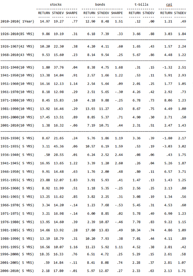
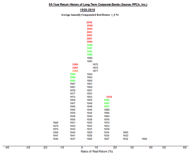
The 85-year history of the U.S. capital markets
The following table shows the history of risk and return for stocks (S&P500), bonds (Citigroup High Grade), T-bills and inflation. There are many lessons in this table, so it’s worth your time and effort to review these results. Here are a few:
- T-bills paid far less than inflation in 2010, earning .12% in a 1.21% inflationary environment. We paid the government to use their mattress.
- Bonds were more “efficient,” delivering more returns per unit of risk, than stocks in the first 42 years, but they have been about as efficient in the most recent 43 years. The Sharpe ratio for bonds was .60 versus .38 for stocks in the first 42 years, but the Sharpe ratio for both was about the same in the more recent 43 years.
- The past decade has been the worst for stocks across the past eight consecutive 10-year periods.
- Average inflation in the past 43 years has been about three times that of the previous 42 years.
- Long-term high-grade bonds fared very well in 2010
MARKET HISTORY FOR YEARS ENDING DECEMBER, 2010 (Source: PPCA, Inc.)
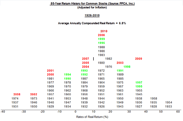
Additional perspective is provided by the following histograms of stock and bond returns.
Read more articles by Ron Surz