Advisor Perspectives welcomes guest contributions. The views presented here do not necessarily represent those of Advisor Perspectives.
Be on your guard against a silent dog and still water.
French Proverb
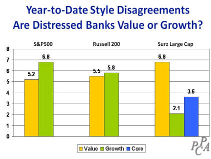
Stock markets delivered positive returns for the first six months of 2011, albeit all of it in the first four months. May and June took back all of the gains from April, leaving only the gains earned in the first quarter. Value investing has dominated markets across the globe, reflecting caution, since the concept of “value” is “safe.” Importantly, the definition of “value” has become very important and index providers disagree – many distressed banks are value in the Russell and S&P indexes but they are growth in my Surz indexes. Surprisingly, financial stocks in the US have suffered this year, while foreign financials have done just fine. Sector allocation decisions should differentiate between foreign and domestic. Are foreign financials in better shape than US financials?
By contrast health care stocks around the globe have led the markets, possibly playing on the aging population theme. Japan and emerging markets have lost value. Japan’s problems stem from their tsunami and nuclear disasters. The emerging markets setback follows a two-year run that doubled the value of these stocks, so valuations were running high but now they have retreated and are once again below market averages. The Price/Earnings ratio for emerging markets is currently 15.5, which is below the current average for all foreign stocks of 17.
Let’s look at how the US market performed and then how foreign markets fared. I’ll conclude on a lighter note with a couple of videos that address key topics in the investment arena.
The year-to-date in review
I examined the performance of the S&P500 and EAFE indexes using attribution analysis described at StokTrib. You should perform similar analyses on your own portfolios to know why you are succeeding or failing, so you can adjust accordingly.
US stock market
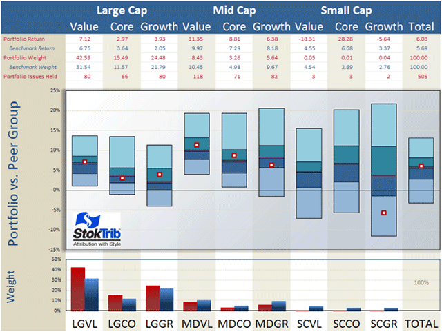
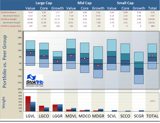
I begin with an analysis of the style composition and performance of the S&P500 as shown in the next exhibit. A quick explanation of this graphic is available at Performance.
The portfolio in the exhibit is the S&P500 index and the benchmark is the entire U.S. stock market. Let’s begin with a discussion of the style make-up of the S&P as shown in the bottom of the graph. Unsurprisingly, the S&P has a large-company orientation, tilted toward large-value companies. The total market is about 30% large-cap value, whereas the S&P is 40% large-cap value.

This large-value orientation helped the S&P (relative to the total market) because value companies performed better in the year-to-date, as shown by the fact that the middles of the floating bars for large-and mid-value are above those of the other styles. These floating bars represent pure scientific peer groups, as described at Portfolio Opportunity Distributions (PODs). The median of each POD is the return for that style in aggregate and the ranges (spread from top to bottom) of each bar are the return opportunities for that style. Note for example the very wide range of opportunities in small-cap growth because this is not a homogeneous group of securities. Also, as you can see, large-value companies returned 6.75%, while mid-value returned even more, earning 9.97%. By contrast, large core and large growth lagged with 3.6% and 2.1% returns respectively. So the offsetting effects of large value versus large growth caused the S&P’s 6% return to be in line with the total market’s 5.7% return.
The other component of attribution is stock selection, which we can see as the location of the dots in the exhibit. For the most part, the stocks selected by the S&P committee performed near their respective medians within each style.
You can use this exhibit to rank individual managers within styles, as well as rank their style components. Just plot your dots in the graph above. For example, locate your manager’s style in the exhibit (large value, small growth, etc.), and place his rate-of-return within the corresponding floating bar, using the scale on the left and the median from the table above as your guide. Voila, an accurate ranking.
Throughout this commentary, I use Surz Style Pure® (SSP) indexes defined at Style Definitions. Because SSP classifies many distressed financials with high Price/Earnings ratios as growth, SSP returns have departed materially in the past three years from those of the name-brand indexes, such as S&P and Russell. Name-brand indexes rely upon Price/Book ratios for their style classifications, which classify distressed financials as deep value. The problem with Price/Book in this current market is that the book values of many distressed banks are grossly overstated because bad debts and mortgages are not fully reflected. Consequently these companies are being misclassified. The disagreements between these indexes and SSP are shown in the graph below.
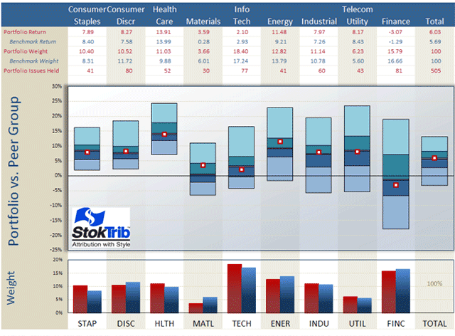
Next, I performed a similar analysis, decomposing the S&P by economic sector, and concluded that the S&P’s sector allocations and stock selections have been in line with the broad market, as shown in the exhibit below. The S&P500, which is about 80% of the total market, has performed like the total market, which is historically unusual. Looking at the middles of the floating bars, health care has been the best performing sector this year, returning 14%, which is 15% more than the worst performing finance sector, which lost 1.3%.
There were a wide range of opportunities in finance, indicating that finance companies are quite different from each other. Or put another way, statistical success in selecting financial stocks has been harder to achieve than in other sectors, like health care which had a relatively narrow opportunity distribution. Beating the benchmark by 2% places you in the top quartile of the health care peer group but the same outperformance left you below the top quartile in the finance peer group.
The performance attribution puzzle is complex, but well worth the time and effort to get it right. Because it tells us why performance is good or bad, attribution is a window into the future. We want confidence in a manager’s strengths and comfort that failures are being addressed and corrected.
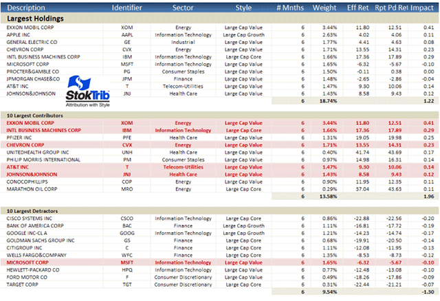
In addition to this attribution, it’s helpful to understand performance at the individual stock level as shown in the following “Biggest, Best, Worst” exhibit. A quick explanation of this report is available at Biggest, Best, Worst.
Here are some observations from this table. Exxon Mobil was the largest holding in the S&P, representing over 3% of the index on average in the year-to-date. The top 10 holdings comprise 18.74% of the index, reflecting concentration in this 500 stock portfolio because an equal weighting would have just 2% in the top 10. As indicated by the red highlights, five of the top 10 holdings were the biggest contributors to total performance (largest positive “impact”, defined as return-times-average-allocation) for the year to date. But only one of the top 10 – Microsoft -- was among the largest detractors from portfolio performance. These are likely to be the same winners and losers that you’ll find in your large-cap managers’ portfolios.
The “effective returns” for these holdings are close to their “report-period returns,” indicating relatively constant weights throughout the year. Effective return is a performance attribution breakthrough described at Effective Return Article. It measures the allocation-weighted return on a stock, and therefore captures the combined effects of stock performance and manager allocation decisions. Effective return is larger than the traditional holding-period return if allocations are advantageous, holding more of the stock when performance is good than when it is bad. Of course the reverse is true if allocations are disadvantageous.
Non-US stock market
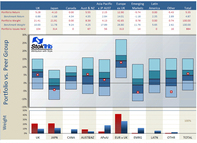
Now let’s turn our attention outside the US, where the total foreign market earned 4.87%, about 1% less than the total US market’s 5.7%. The Europe, Australia and Far East (EAFE) index outperformed the total foreign market, earning 5.35%, which was close to the total US market. The exhibit below shows that, like the S&P, the EAFE index is large-value oriented, and this orientation was in favor because large-value companies performed well. Also like the S&P, stock selection within styles was median. This graph can be used to rank your foreign managers.
Now let’s look at country performance outside the US. As shown in the following exhibit, Japan was the worst performing country, and EAFE was overweight Japan. This detrimental allocation was offset by an overweight to Europe ex-UK, which was the best performing region. Japan lost 1.68% while Europe ex-UK earned 14%. Emerging Markets suffered a modest setback, losing 1.18%. Since EAFE is virtually void emerging markets, this underweight benefitted performance.
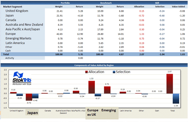
Let’s take a closer look at the attribution analysis for EAFE. A brief explanation for interpreting the following exhibit is available at Attribution Graph. The graph shows that allocation effects (in red) were the major components, with the Japan overweight subtracting .72% and the Europe ex-UK overweight adding back 1.33% -- a 0.6% net gain. Plus the emerging markets underweight added an additional .75%, bringing the allocation benefit to over 2%, including additional regions. By contrast, stock selection, especially in Japan, subtracted 1.04%. In summary, EAFE’s 1% outperformance above the total market was due to advantageous country allocations that added 2%, offset by disadvantageous stock selections that subtracted 1%.
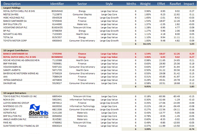
Before we leave the foreign markets, let’s look at the Biggest, Best and Worst stocks in the EAFE. The largest company is Royal Dutch Shell, comprising 3.96%. The 10 largest companies in this 800-stock index make up 16.1%, which like the S&P represents a weighting toward larger companies, since an equal weighting would have 1.25% in any 10 stocks. Two of the largest stocks were among the biggest contributors, but none were among the largest detractors, a reflection of the dominance of large companies during this period. Four of the largest detractors are Japanese companies.
Now for some comic relief
You’ve had some pretty serious reading up to this point, so I’ve decided to end this commentary on a lighter note. We’ve created two videos that deliver important messages in a humorous way.
The first, Investment Manager Due Diligence from a Consultant’s Perspective,
Investment Manager Due Diligence from a Consultant's Perspective shares an interview process that many of you have experienced. “Trust but verify” is the mission of real due diligence, and it’s not always easy. For equality sake we’re working on a similar video from an investment manager’s perspective. Let us know if you’re interested.
The second, The Sad Comedy of Target Date Funds
The Sad Comedy of Target Date Funds
Satire with a cause: Challenge the status quo. You'll laugh. You'll cry. You'll learn why target date funds can be better. Webinar on 9/15/11.
Target date funds are devised for profit, not the benefit of participants. Employees feel the sting of this sick joke on fiduciaries. Realistic objectives can end the farce, and transform these funds into worthwhile investments. Put the smiles back on the faces of beneficiaries.
Subscribe and Register for our Webinar:
http://www.targetdatesolutions.com/subscribe.php
Read more articles by Ron Surz