Advisor Perspectives welcomes guest contributions. The views presented here do not necessarily represent those of Advisor Perspectives.
If history repeats itself, I should think we can expect the same thing again.
Terry Venables, former soccer player and media pundit
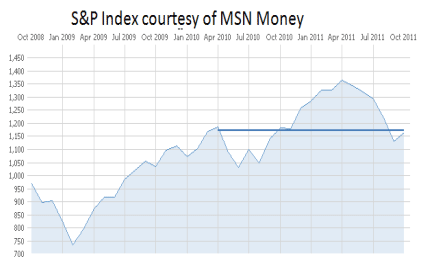
Stock markets around the world plummeted in the third quarter, with the US market losing 16% and foreign markets faring somewhat worse with 17% losses. This quarter’s loss reverses the gains of the first quarter and brings year-to-date returns below water, with domestic markets losing 11% and foreign markets losing 13%. Taking a longer view, the losses in the past five months retraced the gains of the previous year, so we stand today in about the same place as we did in April 2010.

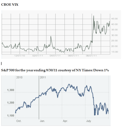
Many have pointed to the VIX volatility index as a reliable worry barometer. In October of 2008, just two months into the start of the five-month crash, the VIX soared above 80, which is about twice where it stands today. As shown in the chart below, the recent market setback was associated with an increase in the VIX. You can also see the significant volatility in both the S&P and the VIX, reflecting the high degree of uncertainty that characterizes our economic crisis. What will happen to Greece, the euro, inflation, jobs, politics, GDP, our national debt, and the list goes on. It is very disconcerting.
We can use the past as a guide to work through this mess, making decisions about the future. Let’s look in detail at how the US market has performed so far this year and then how foreign markets have fared. I’ll conclude with a warning to fiduciaries regarding target-date funds.
The year-to-date in review
I examined the performance of the S&P500 and EAFE indexes using attribution analysis described at StokTrib. You should perform similar analyses on your own portfolios to know why you are succeeding or failing, so you can adjust accordingly.
US stock market
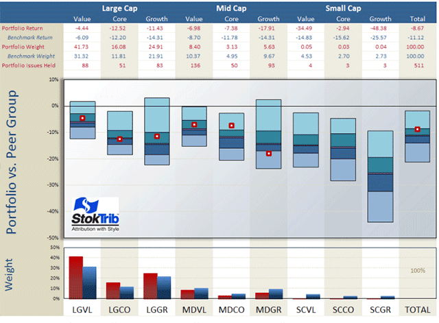
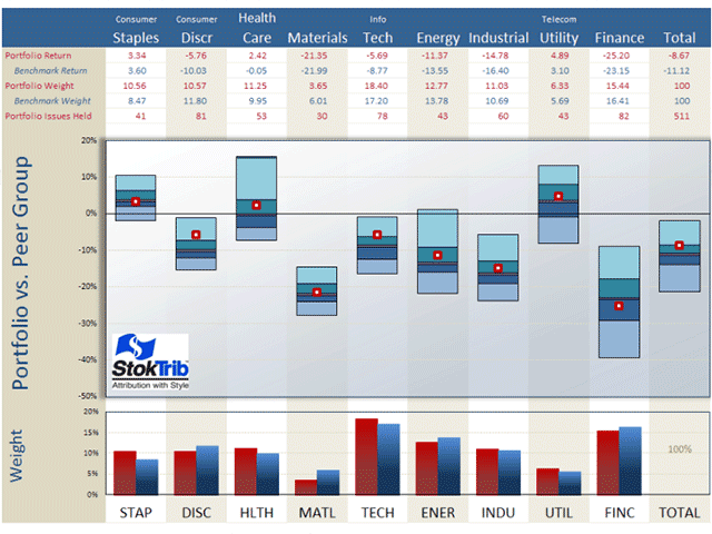
I begin with an analysis of the style composition and performance of the S&P500 as shown in the next exhibit. A quick explanation of this graphic is available at Performance.
The portfolio in the exhibit is the S&P 500 index and the benchmark is the entire U.S. stock market. Let’s begin with a discussion of the style make-up of the S&P as shown in the bottom of the graph. Unsurprisingly, the S&P has a large-company orientation, tilted toward large-value companies. The total market is about 30% large-cap value, whereas the S&P is 40% large-cap value. This orientation was in favor, causing the S&P to outperform the total market. The S&P has lost 8.67% in the year-to-date, defending well versus the total market’s 11.12% loss. All of the S&P advantage arose in the current quarter; it had been lagging the broad market through June. The S&P also lagged the total market in calendar 2010. In other words, large companies made a come-back in the 3rd quarter.
This large-value orientation helped the S&P (relative to the total market) because large and value both performed better than the market in the year-to-date, as shown by the fact that the middles of the floating bars for large-and mid-value are above those of the other styles. These floating bars represent pure peer groups, as described at Portfolio Opportunity Distributions (PODs). The median of each POD is the return for that style in aggregate and the ranges (spread from top to bottom) of each bar are the return opportunities for that style.
There is a very wide range of opportunities in small-cap growth, because this is not a homogeneous group of securities. Also, large-value companies have lost only 6.09%, and mid-value has lost 8.70%. By contrast, large core and large growth lagged with 12.20% and 14.31% losses respectively. The largest loses have occurred in smaller companies, especially small-cap growth, which lost 25.57%.
The other component of attribution is stock selection, which we can see as the location of the dots in the exhibit. For the most part, the stocks selected by the S&P committee performed near their respective medians within each style.
You can use this exhibit to rank individual managers within styles, as well as rank their style components. Just plot your dots in the graph above. For example, locate your manager’s style in the exhibit (large value, small growth, etc.), and place his rate-of-return within the corresponding floating bar, using the scale on the left and the median from the table above as your guide. Voila, an accurate ranking.
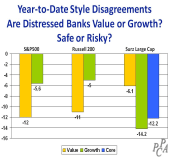
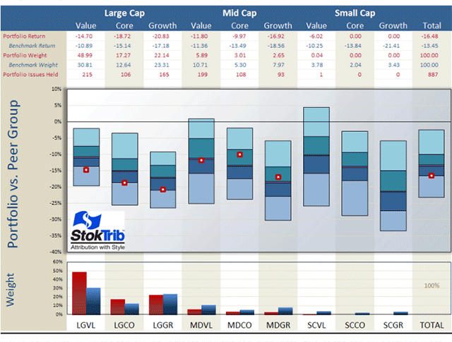
Throughout this commentary, I use Surz Style Pure® (SSP) indexes defined at Style Definitions. Because SSP classifies many distressed financials with high price/earnings ratios as growth, SSP returns have departed materially in the past four years from those of the name-brand indexes, such as S&P and Russell. Name-brand indexes rely upon price/book ratios for their style classifications, which classify distressed financials as deep value. The problem with price/book in this current market is that the book values of many distressed banks are grossly overstated because bad debts and mortgages are not fully reflected. Consequently these companies are being misclassified. The disagreements between these indexes and SSP are shown in the graph on the right.
Next, I performed a similar analysis, decomposing the S&P by economic sector, and concluded that the S&P’s sector allocations have been in line with the broad market, and its stock selections have exceeded the market averages in consumer discretionary and technology, as shown in the exhibit below. Looking at the middles of the floating bars, consumer staples has been the best performing sector this year, returning 3.6%, which is 27% more than the worst performing finance sector, which lost 23.15%. Sector allocation has mattered a lot, and financials have been the big factor, driving the market and style indexes.
There were a wide range of opportunities in finance, indicating that finance companies are quite different from each other. Or put another way, statistical success in selecting financial stocks has been harder to achieve than in other sectors, like consumer staples which had a relatively narrow opportunity distribution. Beating the benchmark by 2% placed you in the top quartile of the consumer staples peer group but the same outperformance left you barely above median in the finance peer group.
The performance attribution puzzle is complex, but well worth the time and effort to get it right. Because it tells us why performance is good or bad, attribution is a window into the future. We want confidence in a manager’s strengths and comfort that failures are being addressed and corrected.
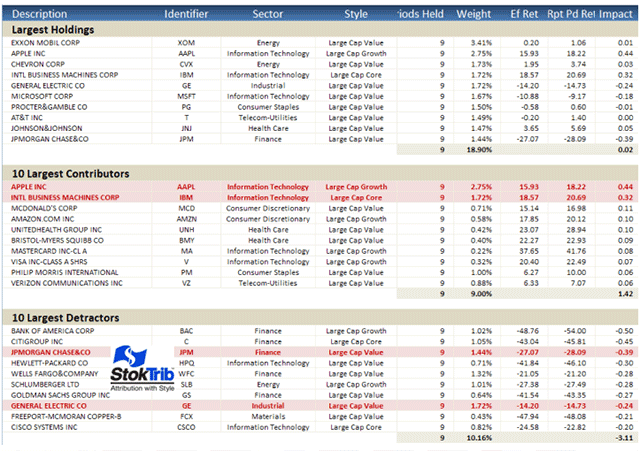
In addition to this attribution, it’s helpful to understand performance at the individual stock level as shown in the following “Biggest, Best, Worst” exhibit. A quick explanation of this report is available at Biggest, Best, Worst.
Here are some observations from this table. Exxon Mobil was the largest holding in the S&P, representing over 3% of the index on average in the year-to-date. The top 10 holdings comprised 18.9% of the index, reflecting concentration in this 500 stock portfolio because an equal weighting would have just 2% in the top 10. As indicated by the red highlights, two of the top 10 holdings were the biggest contributors to total performance (largest positive “impact”, defined as return-times-average-allocation) for the year-to-date. Similarly, two of top 10 holdings were the largest detractors from portfolio performance. These are likely to be the same winners and losers that you’ll find in your large-cap managers’ portfolios. The largest contributors were predominantly technology stocks, while the biggest detractors tended to be financials.
The “effective returns” for these holdings are close to their “report-period returns,” indicating relatively constant weights throughout the year. Effective return is a performance attribution breakthrough described at Effective Return Article. It measures the allocation-weighted return on a stock, and therefore captures the combined effects of stock performance and manager allocation decisions. Effective return is greater than the traditional holding-period return if allocations are advantageous, holding more of the stock when performance is good than when it is bad. Of course the reverse is true if allocations are disadvantageous.
Non-US stock markets
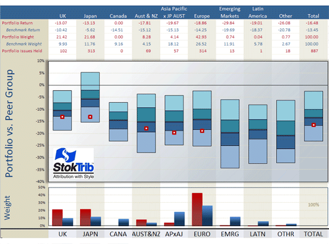
Now let’s turn our attention outside the US, where the total foreign market lost 13.5%%, 2.5% worse than the total US market’s 11% loss. The Europe, Australia and Far East (EAFE) index underperformed the total foreign market, losing 15%. Like the US, value-oriented foreign companies have lost less. The exhibit below shows that, like the S&P, the EAFE index is large-value oriented, and this orientation was in favor because large-value companies performed well. But unlike the S&P, stock selection within styles was below the medians for large companies. We use the EAFE exchange traded fund (EFA) in the following analysis, which underperformed the published index return somewhat. This graph can be used to rank your foreign managers.
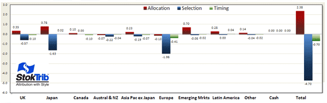
Now let’s look at country performance outside the US. As shown in the following exhibit, Japan was the best performing country, and EAFE is overweight Japan. This beneficial allocation was augmented by a lack of holdings in emerging markets, which was the worst performing region. Japan lost “only” 5.62% while emerging markets lost 19.69%. In 2009 and 2010 Japan was a poor performing country and emerging markets performed well, so 2011 has brought a reversal. The EAFE underperformed the broad foreign market in every region, so stock selection detracted from performance.
Let’s take a closer look at the attribution analysis for EAFE. A brief explanation for interpreting the following exhibit is available at Attribution Graph. The graph shows that the selection effects (in blue) were the biggest factors, subtracting 4.7% from performance due mostly to poor performance in Japan and Europe. This was offset by good allocations (in red) to Japan and emerging markets, adding 3.38% to return.
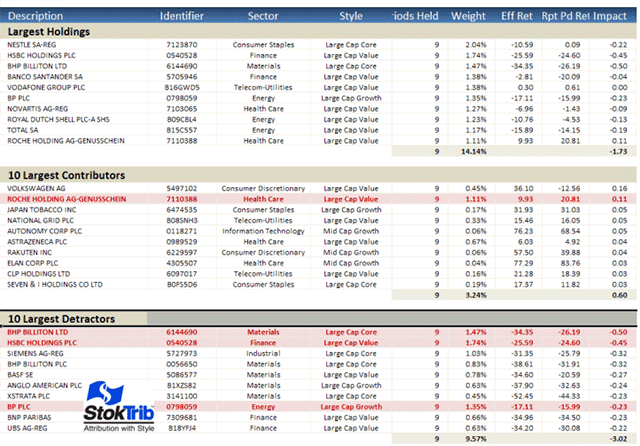
Before we leave the foreign markets, let’s look at the biggest, best and worst stocks in the EAFE. The largest company is Nestle, comprising 2.04%. The 10 largest companies in this 800-stock index make up 14.14%, which like the S&P represents a weighting toward larger companies, since an equal weighting would have 1.25% in any 10 stocks. Only one of the largest stocks, Roche, was among the biggest contributors, whereas three were among the largest detractors. Materials companies make up most of the biggest detractors, but no particular sector stands out among the biggest contributors.
Now for some comic relief
You deserve a little break from all of this bad news so we’ve provided a humorous video on investment manager due diligence. Investment Manager Due Diligence from a Consultant's Perspective shares an interview process that many of you have experienced. “Trust but verify” is the mission of real due diligence, and it’s not always easy. We hope you enjoy it.
That’s enough fun. Turning back to our concerns, we conclude with a warning to fiduciaries regarding their target date fund investments. 2008 has not been forgotten or forgiven. Beneficiaries deserve protection, but they are not getting it, especially near the target date.
Fiduciary alert: Target-date funds are still playing with fire despite 2008 losses
“Don’t worry, be happy” is hardly a prudent theme song for target date fund (TDF) fiduciaries. It could lead you into the “Burning ring of fire.” Attention all fiduciaries. This warning is for you.
Recent market losses portend yet another major upset for target date funds – 2008 could happen again, perhaps soon. Are you prepared this time? Lessons ignored today set the stage for lawsuits— loss-suits – tomorrow. There is no fiduciary upside to risk taking at the target date, but there’s plenty of downside.
The strategic responses to 2008’s losses have been minimal. Consequently, you are exposed to more fiduciary risk today than you were three years ago because this time there is no excuse for sloppy risk management. Importantly, mutual fund companies are simply offering product, with little fiduciary liability on their part, whereas your selection carries great responsibility. Because they are predominantly defaults, TDFs are employer directed, which dictates a higher standard of care than participant directed elections.
You can’t blame a fund company for your investment losses, however painful they may be at the target date, but you can guard against the pain by choosing a conservative glide path. You’re on your own. Caveat emptor for TDF subscribers should be a warning label that states “despite its convenience and popularity, entrusting TDF assets to your bundled service provider is a decision to expose defaulted employees nearing retirement to excessive risk (IMHO) of approximately 55% in equities.“ You need to know the ending equity allocation of your TDF selection, and to embrace that exposure because you own it.
A blast from the past will leave you aghast
Before TDFs became popular the tradition was to default employees into money market funds, a sound practice for those nearing retirement. Has the status of TDFs as Qualified Default Investment Alternatives (QDIAs) suddenly overturned the tenets of prudence? With no credible justification whatsoever you’ve moved from safeguarding savings at retirement date to 55% in equities. Why? Managing longevity risk is not a justification since most withdraw their savings at retirement, plus there is no glide path that can realistically manage longevity risk other than The Hemlock Fund.
Don’t wait too long. Cowboy Wisdom observes that Lettin' the cat outta the bag is a whole lot easier than puttin' it back in. As of 9/30/2011, the 2020 target date funds of major providers had lost about 8% year-to-date, while the S&P500 index has lost 8.9%. These TDFs are losing almost as much as the stock market for those nearing retirement.
Read more...
Read more articles by Ron Surz