Advisor Perspectives welcomes guest contributions. The views presented here do not necessarily represent those of Advisor Perspectives.
The truth is rarely pure and never simple, Oscar Wilde
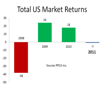
After feasting on the US stock market’s 54% run-up from 2009 to 2010, we starved for performance in 2011, suffering a 1% loss. Some say the markets were due for a “breather” so this lull is healthy, but most say we’re lucky that results weren’t much worse, as they were outside the US.

Let’s take a close look at the details of what occurred in 2011 so we can assess the difficulties and prepare for the surprises 2012 may bring. The recent lessons we’ve learned about excesses and fraud, especially those of the fiasco in 2008, have not yet been entirely digested, and they should certainly not be forgotten. Despite popular opinion, we have not yet recovered 2008 losses. One might think that a 54% gain in 2009-2010 more than offset the 38% loss in 2008, but the realities of compounding reveal that we are still 5% underwater; the four-year return ending 12/31/2011 was an annualized loss of 1.4% per year.
So in this end-of-year commentary I review the lessons of 2011 around the globe and conclude with my traditional review of the longer-term history of U.S. markets over the past 86 years. As usual, these insights arm you for thoughtful investment manager due diligence.
The Year 2011 in Review
I’ll review the year by analyzing why popular indexes, namely the S&P500 and the EAFE, performed as they did. I provide attribution analyses set against a backdrop of the entire market.
US Stock Market
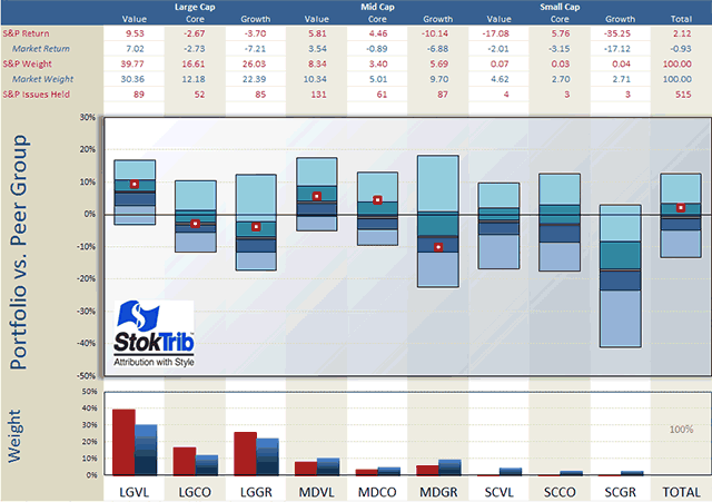
We begin with an analysis of the style composition and performance of the S&P500 as shown in the next exhibit.
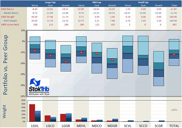
The portfolio in the exhibit is the S&P500 index and the benchmark is the entire U.S. stock market, as provided by Compustat. Let’s begin with the style make-up of the S&P as shown in the bottom of the graph. Unsurprisingly, the S&P has a large-company orientation, especially tilted toward large-value companies. The total market is about 30% large-cap value, whereas the S&P is 40% large-cap value.
This large-value orientation benefitted the S&P because value companies, especially larger value companies, performed well in 2011, as shown by the middles of the floating bars in the center graph. These floating bars represent pure scientific peer groups described at Portfolio Opportunity Distributions (PODs). The median of each POD is the return for that style in aggregate and the ranges are the return opportunities for that style. As you can see, large- and mid-size value companies returned 7% and 4% respectively, with the S&P companies in these styles performing even better. By contrast, all other styles had negative returns in the year, with small growth declining most, with a painful 17% loss.
This concentration in large-value companies caused the S&P to outperform the broad market, earning 2.12% versus the market’s 0.93% loss, as shown in the far right table and floating bar. In other words, allocation to styles benefited the S&P relative to the total market in 2011. The other component of attribution is stock selection, which we can see as the location of the dots in the exhibit. For the most part, the stocks selected by the S&P committee performed near their respective medians within each style, with the exception of mid-cap core, where S&P stocks substantially outperformed.
You can use this exhibit to rank individual managers within styles, as well as rank their style components. Just plot your dots in the graph above. For example, locate your manager’s style in the exhibit (large value, small growth, etc.), and place his or her rate of return within the corresponding floating bar, using the scale on the left and the median from the table above as your guide. Voila, an accurate ranking.
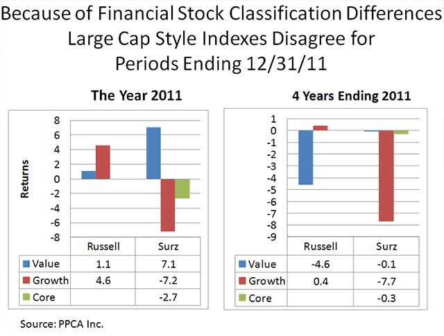
Throughout this commentary, I use Surz Style Pure® (SSP) indexes defined at Style Definitions. Because SSP classifies many distressed financials with high price/earnings ratios as growth, SSP returns have departed materially in the past four years from those of the name-brand indexes, such as Russell. Name-brand indexes rely upon price/book ratios for their style classifications, which classify distressed financials as deep value. The problem with price/book in this current market is that the book values of many distressed banks are grossly overstated because bad debts and mortgages are not fully reflected. Consequently these companies are being misclassified. The disagreements between these indexes and SSP are shown in the next graph.
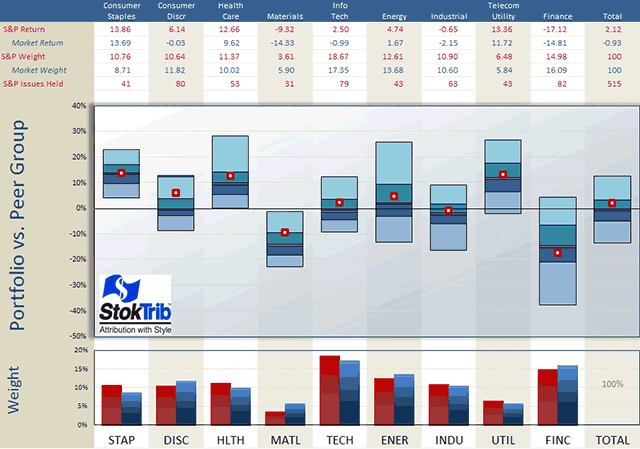
Next, I performed a similar analysis, decomposing the S&P by economic sector, and concluded that stock selection benefitted performance of the index. But how can that be in light of what I just concluded in the previous paragraph where stock selection was generally not a factor?
Sector allocations of the S&P are in line with those of the total market, mainly because the S&P is a large part of the total market. What we’re seeing in the next exhibit are the style impacts on performance within economic sectors: style effects manifest themselves as stock selection when the S&P is decomposed by sector.
We need to be careful to evaluate skill rather than style. An attribution against the S&P500 by sector can be easy in some sectors and difficult in others if the S&P is not the correct benchmark. For example, a manager with a broadly diversified portfolio will have a return on consumer discretionary stocks that is something close to the -.03% shown for the total market in the table below. This is 6% less than the S&P’s 6.14%% return in consumer discretionary, which would appear to be a big failure, and it would be a big failure if the S&P were the correct benchmark. But in this hypothetical we’ve said that the manager is more broadly diversified than the S&P, so the underperformance is most likely caused by style (broad diversification) rather than poor stock picking.
The performance attribution puzzle is complicated, but well worth the time and effort to get it right. Because it tells us why performance is good or bad, attribution is a window into the future. We want confidence in a manager’s strengths, and comfort that failures are being addressed and corrected.
Follow the “dancing balls” in the exhibit below. The S&P’s only “failure” (i.e., performance below the median of the broad market) was in finance. It excelled in every other sector, especially consumer discretionary. Note also the middles of the floating bars; consumer staples and utilities performed best in the year while finance performed worst by a long shot. And also note the ranges of the bars, with financials exhibiting a wide range of opportunities, reflecting the volatility within that segment of the market; where there’s risk there’s opportunity.
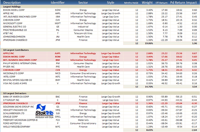
In addition to this attribution, it’s helpful to understand performance at the individual stock level as shown in the following “Biggest, Best, Worst” exhibit.
Here are some observations from this table. Exxon Mobil was the largest holding in the S&P, representing over 3% of the index on average in 2011. The top 10 holdings comprise 19.06% of the index, reflecting concentration in this 500 stock portfolio because an equal weighting would have just 2% in the top 10 (0.2% in each stock). As indicated by the red highlights, four of the top 10 holdings were the biggest contributors (largest positive “Impact,” defined as return times allocation) for the year, and only one of the top 10 was among the largest detractors; these are likely to be the same winners and losers that you’ll find in your large-cap managers’ portfolios.
Note also that four large banks were the biggest detractors. The “effective returns” for these holdings are close to their “report-period returns,” indicating relatively constant weights throughout the year. Effective return is a performance attribution breakthrough described at Effective Return Article. It measures the allocation-weighted return on a stock, and therefore captures the combined effects of stock performance and manager allocation decisions. Effective return is larger than the traditional holding period return if allocations are advantageous, holding more of the stock when performance is good than when it is bad. Of course the reverse is true if allocations are disadvantageous.
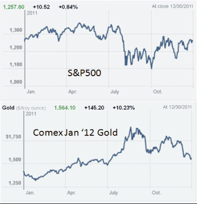
We dodged a bullet in 2011. Triggered by S&P’s downgrade of US government debt, third quarter losses brought the year-to-date US stock return down to a 9% loss. It was looking like 2011 was going to be a big fat letdown, but the last quarter of the year brought a nice recovery. In the meantime, gold, a current hot topic, continued its upward progression, and actually increased in value in the third quarter, as US stocks plummeted. Gold was less volatile than U.S. stocks. (Graphs courtesy of the New York Times)
Non-US stock market
Now let’s turn our attention outside the US, where the total foreign market lost 11.35%, far worse than the total US market’s 0.94% loss. The Europe Australia and Far East (EAFE) index performed somewhat worse than the total foreign market, losing 11.87%. The following exhibit shows that, like the S&P, the EAFE index is large-value oriented, and this orientation was in favor. However, unlike the S&P, stock selection was poor. In other words, the EAFE had offsetting effects: style was in favor but the stocks included in EAFE were out of favor in 2011. Like the U.S. graph, this graph can be used to rank your foreign managers.
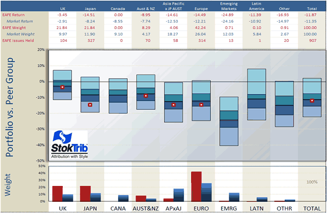
As shown in the following exhibit, emerging markets were the worst performing region, and EAFE was void this region, benefitting performance. Also benefitting performance, EAFE was overweight the best performing country, the UK. The underperformance of EAFE was caused by poor stock selection as shown by the below-median locations of EAFE performance within every region, especially Japan.
These observations and graphics can be used in client meetings to describe the economic environment and to evaluate investment manager performance. End-of-year reporting is a big deal, and these graphs can help. Because my analyses are fairly complicated and involved, I’ve created a very brief Xtranormal video that explains my philosophy in a humorous but meaningful way, at Trust but Verify.
Getting to the core
The analyses above use a definition of “core” that is the stuff in the middle, in between value and growth. This “centric” definition is in contrast to the “blend’ definition that we have been using for many years. Blend core is the entire market, or at least most of it, like the S&P 500 or the Russell 3000. The distinction between “centric” and “blend” is important for a number of reasons, described in detail at Centric Core. Portfolio construction is improved with centric core, but not blend core, contrary to common belief.
Most actively managed money programs employ the four-corner solution, populating the corners (large value, large growth, small value, small growth) of the market, abandoning the middle. There’s an unintended bet against the middle of the market that can be corrected with centric core, but not blend core. Similarly, most core-satellite portfolios currently use blend core, which dilutes the decisions of the active (satellite) managers by adding value and growth stocks that the active managers don’t want to hold. In a nutshell, centric core is a completeness fund, whereas blend core is a dilutive detractor that should only be used if you don’t trust your active managers, but if you don’t trust them you shouldn’t use them at all. The 45-stock Surz Style Pure® Centric Core model is available on Placemark, TD Ameritrade, Smartleaf, Folio Dynamix, Adhesion, and Capital Market Consultants.
A word on target date funds: They’ve failed their stress test
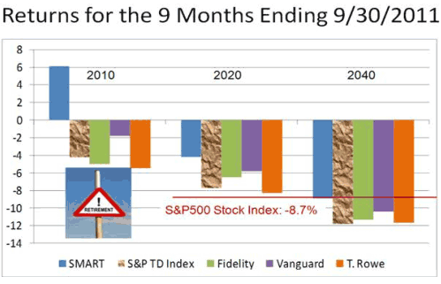
Target date funds (TDFs) were stress tested in the first nine months of 2011 and they failed. The S&P500 lost 8.7% in these nine months, presenting a quick test of TDF ability to defend. But instead of defending, the typical 2020 fund lost 7.7%, which is only 1% better than the 8.7% loss suffered by the S&P500. Funds with a 2020 target date should be positioned to defend because the target date is near. As for longer dated funds, the typical 2040 fund lost even more than the S&P, declining 12%. And worst of all, 2010 funds lost 4%; these funds are presumably for those already in retirement, who can ill afford losses. Please see the graph on the right for the disturbing details (SMART in the exhibit follows the Safe Landing Glide Path described below). I used the S&P target date fund index as the measure of the typical fund, since it is a composite of all target date mutual funds. The lessons of 2008, when the average 2010 fund lost 25%, have gone largely ignored, and this stress test proves it.
TDFs have failed because little has changed, despite the outcry for reform following the 2008 disaster. Oh sure, fees have come down a little and some providers have moved to “to” funds but nothing of real substance is different. It’s time for plan participants and their supporters to express their dissatisfaction and to demand better.
Contrary to popular participant belief, TDFs do not protect the vulnerable from equity loss. The most vulnerable are those nearing retirement because their account t balances are highest and the ability to recover from loss is minimal. TDFs didn’t protect in 2008, and nothing has happened to change that. Most participants in TDFs are defaulted into this product, which means that most participants rely upon their employers to do the right thing by protecting participant assets, especially near retirement (even though they are not).
Fiduciaries are duty bound to seek solutions rather than settling for high-risk products that are oblivious to history. Ignoring the past and hoping its different the next time is not an option, and it’s certainly not an enlightened view of risk management. Fiduciaries are obligated to actually vet their TDF selections and to establish objectives that are truly in the best interests of employees.
For the most part, TDFs are too risky at the target date because they aspire to serve participants beyond retirement. Even “to” funds hope to keep assets in retirement. So risk is the medicine these “doctors” serve up to folks who are expected to live long lives, and the occasional losses are the side effects that should be expected from time to time. The problems with this view are: (1) most participants withdraw their accounts at retirement, and (2) there is no glide path (asset allocation pattern) that can possibly serve to manage longevity risk; insurance companies exist for just this purpose.
Fortunately, there is an alternative view that the sole mission of a TDF is to get the beneficiary safely to the target date. Attempts to do more lead to excessive risk. Specifically, meaningful objectives for TDFs are:
- Don’t lose participant savings, and
- Make as much as you can but don’t lose participant savings
These create real reform to protect the vulnerable.
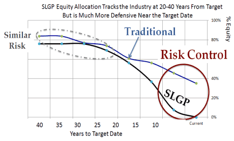
Taking a lesson from 2008, the course of action for achieving these objectives is the patent-pending Safe Landing Glide Path® (SLGP) that integrates the tenets of Modern Portfolio Theory (MPT) with the disciplines of Liability Driven Investing (LDI). Yes, this one-size-fits-all-set-it-and-forget-it glide path is the plan for achieving these straightforward objectives. The SLGP is a concept, a blueprint, for target date funds. It’s like an “ideal gas” in physics. It is not a product per se – you can’t buy the SLGP target date fund. But you can design a TDF to follow the SLGP. For example, the SMART Funds® are collective investment trusts that follow the SLGP, offered by Hand Benefit & Trust, Houston.
Importantly, the emphasis is placed on safety, as it should be, so asset allocation at target date is mostly TIPS and T-bills, as shown in the graph on the right.
The proof of the pudding is in the tasting. As shown in the graph above, SMART Funds pass the recent stress test. It’s also worth noting in this exhibit that the Big 3 – T. Rowe, Fidelity and Vanguard—failed the test, as did the industry as whole, represented by the S&P Target Date Index. For a humorous look at the problems please see our short movie at Target Date Movie.
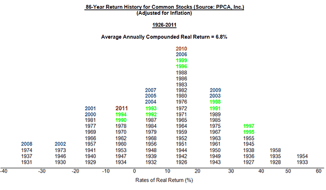
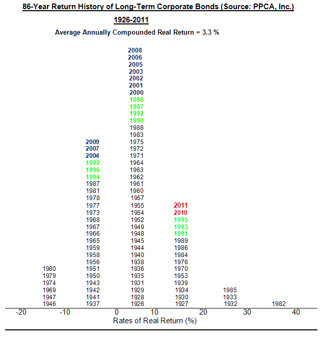
The 86-year history of the U.S. capital markets
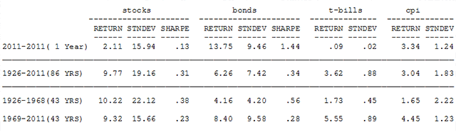
The following table shows the history of risk and return for stocks (S&P500), bonds (Citigroup High Grade), T-bills and inflation. There are many lessons in this table, so it’s worth your time and effort to review these results. For example, here are a few of the lessons:
- T-bills paid far less than inflation in 2011, earning .09% in a 3.34% inflationary environment. We paid the government to use their mattress.
- Bonds were more “efficient,” delivering more returns per unit of risk than stocks in the first 43 years, but they have been about as efficient in the most recent 43 years. The Sharpe ratio for bonds is .56 versus .38 for stocks in the first 43 years, but the Sharpe ratio for both is about the same in the more recent 43 years.
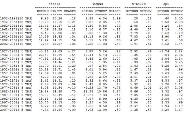
- The past decade has been the worst for stocks across the past eight consecutive 10-year periods.
- Average inflation in the past 43 years has been about 2.5 times that of the previous 43 years: 1.65% in 1926-1968 versus 4.45% in 1969-2011.
- Long-term high-grade corporate bonds fared very well in the last two years, which is surprising in light of low interest rates. America has benefitted from confidence in the US dollar, resulting in material decreases in interest rates. It’s a “Limbo” market: How low can you go? (The “Limbo” is a dance contest where participants attempt to pass below an extended pole that is progressively lowered.)
MARKET HISTORY FOR YEARS ENDING DECEMBER, 2011 (Source: PPCA, Inc.)
Additional perspective is provided by the following histograms of stock and bond returns.
Read more articles by Ron Surz