Advisor Perspectives welcomes guest contributions. The views presented here do not necessarily represent those of Advisor Perspectives.
More people are flocking to the web and searching for you and your firm. Your advisor website must be set up to properly convert prospects who may be visiting you for the first time.
A “high converting” website means visitors are completing the desired goal you set out to achieve. It could be signing up for your newsletter, booking time on your calendar or downloading your e-book.
You can pay a lot of money for a website design. But that doesn’t mean that it’ll have a good conversion rate.
Before we dive in, I want to outline some important points:
- It takes about 50 milliseconds (that’s 0.05 seconds!) for users to form an opinion about your website that determines whether they’ll stay or leave.
- First impressions are 94% design related.
- Users spend an average of 5.94 seconds looking at a website’s main image.
-
38% of people will stop engaging with a website if the content or layout is unattractive.
-
64% of site visitors want to see a company’s contact information on its homepage.
-
70% of small business websites lack a call to action (CTA) on their homepage.
To improve your website, I’m sharing the top five elements the highest converting advisor websites have in common.
1. Cater to a specific niche
I said it before and I’ll say it a thousand times over: You. Need. A. Niche!
Clearly establishing your niche before you go into the website design process is going to differentiate you from the nearly 13,000 other registered investment advisors. Marketing yourself as someone who works specifically with divorcees and widowers, for example, establishes you as an expert in a field that is underserved. Since this group is narrow, you have the opportunity to become a well-known expert much faster and your visibility will increase.
Additionally, establishing your niche before setting out to develop your website is going to drive the tone of voice, messaging, and look and feel. Clearly establish on your website who you do (and don’t) serve. Be explicit and direct about your expertise and your target demographic. Make sure who you serve is straightforward from the moment site visitors land on your homepage, so a user doesn’t have to scroll to find out.
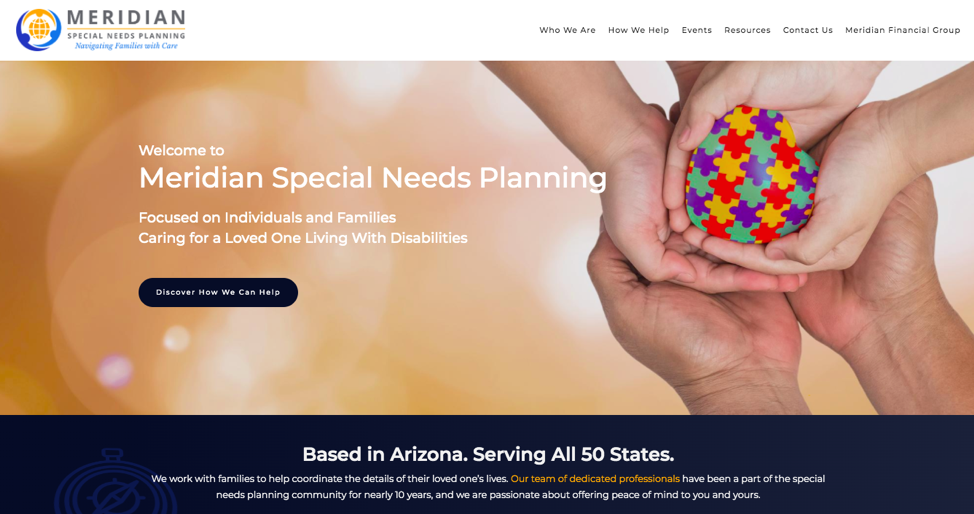
In the example below from Meridian Special Needs Partners, it’s very clear right when you land on its homepage that they specializing in working with individuals and families who are caring for loved ones with disabilities.
Investors hire financial advisors based on their expertise in one specific area. If your core focus changes, clients will doubt that your firm will continue to have knowledge in the areas that matter to them. By staying true to your original niche, you are showing current and prospective clients that you are loyal to your specialization.
2. Have a calendar link
A survey we conducted last year at Twenty Over Ten found that advisors who receive 6-10 or 11 or more clients per year had a calendar link on their website. Including a link to your calendar on your website is a surefire way to book more appointments with prospects. Adding this simple button shows potential clients when you are available. It helps you keep your calendar organized and can alleviate the stress of double and overbookings.
There are many different scheduling tools available. I believe strongly that this is such an important piece to efficiently running your advisory business that I’ve implemented a one-click integration with Calendly. The simpler you can make it for prospects to book a meeting with you, the better. If your booking link is hard to find or there are too many barriers to entry, it will deter prospects. Once someone books an appointment, it increases the likelihood that they will convert to a client.
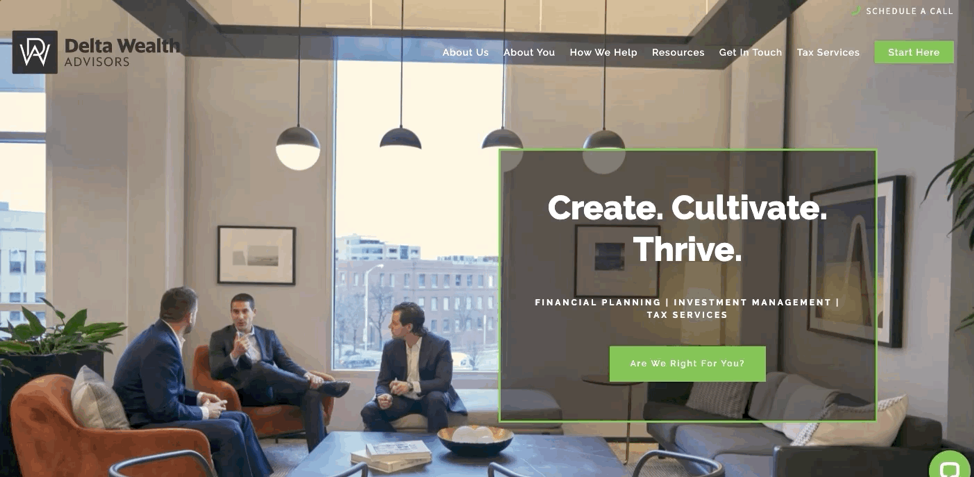
Delta Wealth Advisors is a great example (below) of how to incorporate a scheduling button on your website. I love that no matter what page you navigate to, the “schedule a call” link is always in the top right corner – easily accessible for visitors no matter where they are in the journey of navigating through the website.
3. Incorporate video
Regardless of age, humans are a visual species. Especially amid a pandemic, video has proven to be one of the most effective tools for business marketing. The average user spends 88% more time on a website that has video. Even more, people retain 95% of a message when they watch a video and only 10% when reading just text. There is a variety of creative ways to incorporate videos onto your website, including:
On your homepage
A video on your homepage is usually the first one that prospects and clients will see when they land on your site. Homepage videos I see are typically more brand-centric, polished and sometimes professionally shot and edited. Your homepage is a great place to house a video that showcases who you are, what you do and how you help people.
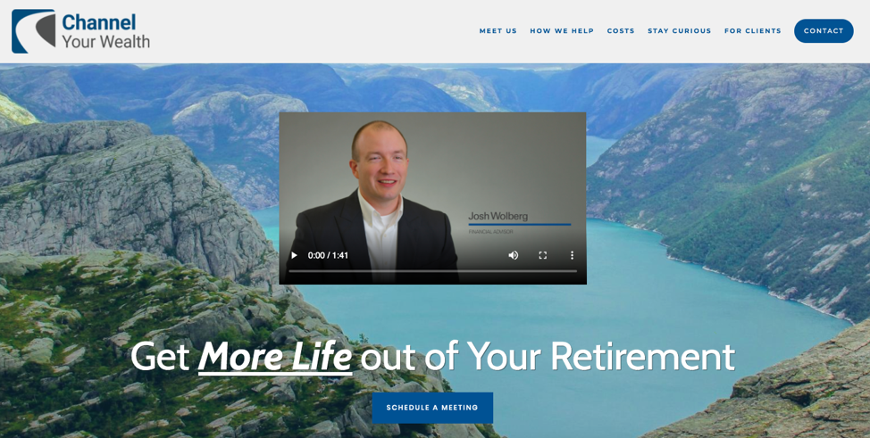
Channel Your Wealth (above) includes a video from its founder on its homepage where they briefly discuss what the firm is all about and how they can help clients to get the most of their retirement.
On your bio page
“About us” or more interview-style videos are also fairly polished, but these are a bit more personal and engaging. They help visitors learn more about you personally. These videos help clients and prospects get a glimpse into who you are, allowing them to form a better first impression and make your brand feel much more human.
On your blog
Videos that are on showcased on your blog are going to be more about the topics that interest your clients and prospects. Additionally, there is typically more flexibility when it comes to creating videos for your blog, so they don’t necessarily have to be as professional and branded as the videos that appear on the main pages of your website. But you want them to be a strong representation of your firm and brand.
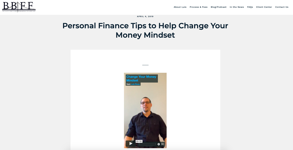
The example below, from Luis F. Rosa, CFP® EA of Build a Better Financial Future, incorporates a quick (less than a minute) home-shot video from his smartphone to accompany his full blog post. The video is placed above the full blog post and is meant to get people excited about a particular topic (personal finance tips to help change your money mindset) and encourage them to keep reading to learn more.
4. Include an “as seen on…” section
Building credibility for yourself and your firm, especially for those just starting out, is a challenge. Another finding from our study uncovered that about 50% of those who included an “as seen on” section on their website generated 6-10 or 11+ clients per year. Including this dedicated section on your website will prove to prospects and clients that you are trustworthy and reliable, which is incredibly important in the financial services industry.
A Strong Advisor Website Is More Important Than Ever During COVID-19
Boost lead generation and turn more prospects into leads by improving your website design and digital marketing efforts.
Our team can help.
Schedule a 1:1 demo today
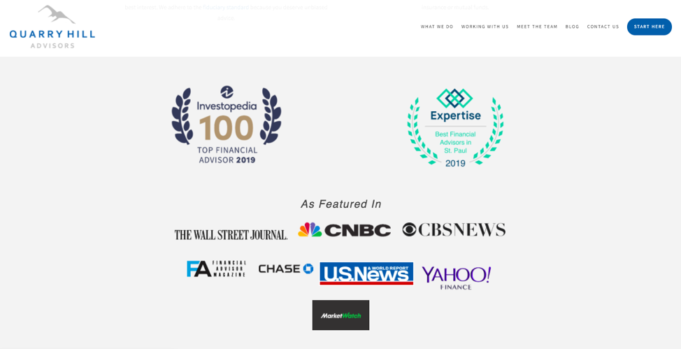
Quarry Hill Advisors (above) incorporates an “as featured in” section on their homepage and includes logos for recent award wins. Each logo links to that respective media mention they’ve achieved. This is not only a great way to differentiate your firm, prove your credibility and showcase your expertise and thought leadership, but it is a great search engine optimization (SEO) tactic to include outbound links to reputable third-party sources. That leads us to the last and final conversion tip.
5. SEO friendly
Optimizing your website for search engines like Google is a hot topic for good reason! An effective SEO strategy will drive more traffic to your website, which means more leads. However, there are hundreds of factors that play into where your site ranks. Given that Google receives over 63,000 searches per second it is a seemingly tough nut to crack. The best and most effective thing you can do is to create relevant, helpful and fresh content.
Creating blog content that provides value and educates your prospective and current clients on your offering and your area of expertise increases brand trust and communicates to your site visitors that you can address and alleviate their pain points and answer their most pressing questions. The rule of thumb when it comes to SEO is to place your users first and create a trustworthy site that includes the necessary information. If you continue to work to create the best website possible, then Google will reward you by boosting your site’s rankings, thus driving more traffic to your business.
Samantha Russell is the chief marketing and business development officer at Twenty Over Ten (a digital marketing and website development company for financial advisors). Samantha helps financial advisors create digital marketing strategies that produce explosive growth through website development, content marketing, SEO, social media and video.
Read more articles by Samantha Russell
 Advisor Perspectives welcomes guest contributions. The views presented here do not necessarily represent those of Advisor Perspectives.