As we go to print, the U.S. major league baseball clubs’ spring training is getting underway in the warm locales of Arizona and Florida. As a kid growing up in San Diego, I would eagerly await the start of the Padres season. But I had no false hopes. The Padres were perennial “cellar dwellers,” falling off the Pennant-chase pace quickly; glancing at the standings in June was a rarity. Inevitably, the second half of each season saw us turning our attention to the batting race where Tony Gwynn, known as “Mr. Padre” and arguably the greatest hitter of his generation, would compete for the highest batting average in baseball. In the 1994 season, Gwynn finished with an average of .390, just off the magical .400 mark last achieved by Ted Williams, coincidentally a native San Diegan, in 1941.
Of course, Williams was the gold standard of hitting. Gwynn, like many players, would seek his counsel to discuss the science of hitting. Before even talking about the mechanics of a swing, Williams instructed all would-be hitters first to develop the mindset to “get a good ball to hit.” He expounded further that “…a good batter can hit a pitch that is over the plate three times better than a great batter can hit a questionable ball thrown to a tough spot. Pitchers still make enough mistakes to give you some in your happy zone. But the greatest hitter living can’t hit bad balls well.”1
Investors, especially those in the asset allocation game, would also be wise to follow the “Splendid Splinter’s” advice. Most asset classes, coming off an impressive record in 2012, are “high and outside” the valuations necessary for future big league returns. Patience is the name of the game today.
Bumpy Path to Real Returns
Unquestionably, 2012 was a very rewarding year in the capital markets. Long-time readers are well acquainted with our equally weighted 16-asset class portfolio as a quick reference for asset allocation opportunities across a global spectrum of exposures.2 Last calendar year, this simple equal-weighted construct would have produced a return of 11.5%. After deducting 2012 inflation of 2.3%, the real return from this mix exceeded 9%. The less diversified but far more ubiquitous 60/40 blend of the S&P 500 Index and BarCap Aggregate Index—what we label a two-pillared portfolio of mainstream stocks and bonds—produced a near-identical return at 11.3%, also earning 9% in real terms.
The breadth of the bull market was also substantial. Only commodities posted a negative return, and that was a paltry 1.1% loss for the Dow Jones UBS Commodity Index. How many investors expected these kinds of returns as we entered 2012? Not many after the debt downgrade in August 2011 and the near-meltdown in Europe during that same timeframe.
Of course, one year’s returns, however good or bad, don’t make or break long-term investment programs. Retirement nest eggs and endowments seek to harvest meaningful real returns, usually centered around 5% above the rate of inflation, over time periods lasting decades. And the past quarter century squarely supports these assumptions. Indeed, we witness a real return of 6.4% since 1988 for the equally weighted 16-asset class portfolio.3 A 60/40 blend was only slightly less at 6.2% per annum after inflation, albeit with a bit more risk.
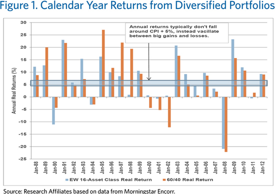
But most investors are surprised to learn that a diversified portfolio’s results falling around the hallowed CPI + 5% is an unusual outcome, at least on an annual basis. Figure 1 displays the calendar year real returns for the 16-asset class portfolio, with the 60/40 asset mix thrown in for good measure. Note the dearth of examples—only 3 in 25 years—where the equally weighted portfolio finished in the seemingly wide range from 3% to 7% above the rate of inflation. The 60/40 investor also came within 2% of the 5% real return target only twice. It just doesn’t happen very often. Instead, the capital markets provide a feast-or-famine history of big “up” years, offset by modest to severe shortfalls, often during crisis periods. Real returns that are negative or soar into double digit territory are more common than returns between these two poles! The average isn’t normal.
Of course, past is not prologue. The next 25 years are unlikely to resemble the past 25 years. So investors shouldn’t count on historical long-term returns, as these numbers were universally built on much higher starting yields than we have today. The average real yield on intermediate Treasuries and TIPS over the past 25 years has been a shade under 3%.4 Thus, while they fluctuated wildly on investor sentiment and macroeconomic drivers, all risk premiums—credit spreads, equity valuations, etc.—were priced off a much higher risk-free real rate. All one needed was an extra 2% from risk premium or alpha! Today, real yields are essentially zero. So both of the simple mixes illustrated are unlikely to achieve long-term returns in the CPI + 5% range. The mean will come down.
Are Valuation Levels Offering a Fat Pitch?
For the tactically inclined, the annual distribution of returns is likely to remain wide even with a lower expectation.5 This is important. If we can capture a decent share of the large up years, and rein in the losses in bad years, meaningful real returns can still be earned. This requires careful attention to the “risk dial.” As Warren Buffett famously said early in his career, we should be “greedy when others are fearful and fearful when others are greedy.”
With a flexible and less constrained approach, we can systematically expand our risk appetite when assets are cheap and investors are terrified, and move to a conservative posture when complacency reigns and investors are “picking up nickels in front of a steamroller.” The most successful investors are those with the discipline to bypass risk when the markets seem tranquil, and the fortitude to step up and buy assets when they are shunned by others.
Today, markets appear increasingly benign, shrugging off some notable long-term headwinds (see our papers on the “3-D Hurricane” and “Unreal GDP,” for example). Let’s review the S&P 500 and REITs, two of the top performing (and more pro-cyclically oriented) assets in recent years. Leading all assets over the past three years, REITs have produced a cumulative return of 79.9% since January 31, 2010. The S&P 500 finished third with an advance of 48.7% for the same period. (The related Russell 2000 Index, a proxy for small U.S. companies, unsurprisingly finished between these two with a 56.0% return.)
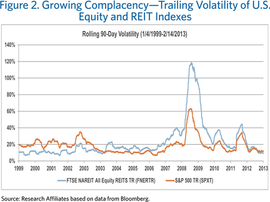
When assets experience such substantial price appreciation, we often observe two distinct yet interrelated cautionary signals. First, investors’ risk aversion declines. Our CIO, Jason Hsu, often talks about time-varying risk aversion on the part of investors. In other words, their tolerance for volatility rises after a period of economic growth and robust stock market returns. Like gamblers with large winnings, investors tend to be more aggressive when they think they are “playing with house money.” We see this trend when we look at annualized volatility data. As Figure 2 shows, equities have trailing 90-day annualized volatility of 12% versus an average of 17% since 1993, and REIT volatility has reached levels not seen since 2003. Playing with house money indeed!
The other signal is high valuations. Assets will naturally exhibit lower yields and, therefore, lower forward-looking returns after substantial advancements. The S&P 500 has a so-called “Shiller P/E” ratio of nearly 23 times trailing 10-year earnings as of January 31, 2013. This falls in the second most expensive decile since 1926. (We arrive at the same decile if we use dividend yield in lieu of P/E.) Because the majority of REIT total returns come from yield, we can simply use REIT yields as a quick comparison of their current valuation versus history. With a yield of 4.1% as of January 31, we find today’s FTSE NAREIT yield easily lands in the most expensive decile of its history dating back to 1970. These kinds of valuations are indicative of declining risk aversion and offer very little in the way of margin for error should we encounter macroeconomic or geopolitical shocks.
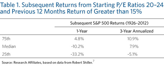
If we don’t get any of these shocks, equities and other growth assets can appreciate further despite their already high valuations. But the odds of that happening are not good. Table 1 illustrates subsequent one- and three-year S&P 500 returns when Shiller P/E ratios are between 20 and 24 and recent results have been strong (which we define as better than 15% over the past 12 months). This is exactly where we find ourselves at the end of January. On a one-year basis, the median return sours to –10.2% and the top quartile “upside” is only 4.8%. If we extend the analysis to the subsequent three years, results improve to a median of nearly 8%, which is a bit more in line with investor expectations, but we still see a lower quartile result of –5.1%.
History indicates equity markets can increase from today’s lofty valuations. How might that happen? We can answer this question by examining the sources of returns. In previous pieces, we have noted that very long-term equity returns come from dividends, real growth in earnings, changes in valuation ratios, and inflation.6 Over the short term, two of these—real earnings growth and change in valuation—swing wildly in connection with the business cycle and investor preferences. Meanwhile, dividends and inflation tend to be a bit more steady, although in the intermediate term, the latter can give us some nasty surprises that directly influence valuations, as we will discuss shortly.
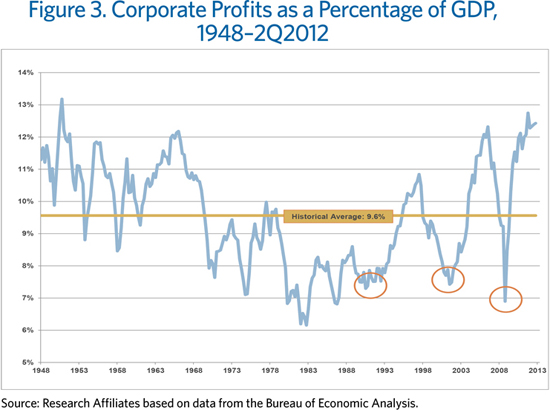
Today’s stock market bulls must be relying on rapid real earnings growth and/or rising P/E ratios. To us, these views are not justifiable. As Figure 3 shows, we have nearly peak profits as a percentage of the economy today.8 This is unlike previous high valuation periods, notably in the early 1990s and early 2000s, where stocks posted lofty returns, despite high multiples, as impressive earnings growth rates were delivered from trough recession earnings (see the orange circles in Figure 3). That doesn’t bode well for today—we’re starting from peak, not trough, earnings! We also have an economy that is unlikely to produce the 3–6% real growth, as it did in the 1960s, that can keep corporate profits growing even if they stay at today’s elevated share of the economy. For us to have rapid real earnings growth, we either need corporate profits to rise as a percentage of the economic pie or we need the pie itself to grow. Both of these scenarios seem unlikely given today’s conditions.
Absent a robust earnings recovery either through a growing corporate sector (from peak levels) or a growing economy lifting all boats, all that’s left for the bullish case is hoping someone will come along and pay a higher price for their shares, no doubt convinced that central banks will lead them to find an even greater price down the road. But how high can prices go? We previously have noted a very strong link between P/E ratios, real interest rates, and inflation.9 When real interest rates are below zero, as they are today, the average P/E ratio is about 11, half today’s level! Recent inflation has been benign. However, when trailing inflation is between 3% and 4%, P/E ratios average about 16 and steadily decline with higher levels of inflation. If one believes in our 3-D thesis, higher levels of inflation are on the intermediate- to long-term horizon. With the five-year forward breakeven rate hovering at 3%, such levels of rising consumer prices seem very plausible over the intermediate term. Where, then, will the rising valuations come from?
Conclusion
Ted Williams was famous for nearly always taking (that is, not swinging at) the first pitch in every at-bat, figuring that the pitcher was going to try and tempt him with a pitch just a bit outside the strike zone. Williams figured, “…when you start fishing for the pitch that’s an inch off the plate, the pitcher—if he’s smart—will put the next one two inches off. Then three. And before you know it you’re making 50 outs a year on pitches you never should have swung at.”10 Mr. Market likewise offers pro-cyclical pitches just a bit outside, nibbling away, hoping the impatient will continue swinging their bats despite ever decreasing odds.
But we don’t have to take a cut. As Warren Buffett explained, “The stock market is a no-called-strike game. You don’t have to swing at everything—you can wait for your pitch. The problem when you’re a money manager is that your fans keep yelling, ‘Swing, you bum!’”11 Warren was speaking about investments within the stock market but the concept applies equally to asset allocation management. If we keep in mind the pattern of returns from diversified portfolios over the 25 years we saw in Figure 1, it’s obvious that markets will offer opportunities for outsized returns. The fat pitches will come along. If we combine these big years with caution in the face of high valuations and decreasing risk tolerance, meaningful long-term outcomes can be had.
Might the bull market in U.S. equities and REITs, despite high valuations and low yields, still advance? Of course! Might investors, clamoring for action, start screaming “Swing, you bum” if the market marches higher? Surely! But investors would be wise to bank some of their outsized 2012 gains.
Endnotes
1. See “Science of Batting,”1968, Sports Illustrated (July 8).
2. Short-term bonds (Merrill Lynch US Corporate & Government 1-3 Year); core bonds (Lehman Brothers US Aggregate Bond); long-term U.S. Treasury bonds (LB US Treasury Long); long-term corporate credit (LB US Long Credit); high-yield corporate bonds (LB US Corporate High Yield); floating-rate notes (Credit Suisse Leveraged Loan); emerging market bonds (JPM EMBI + Composite); emerging market local currency (JPM ELMI + Composite; convertible bonds (ML Convertible Bonds All Qualities); Treasury Inflation-Protected Securities (LB Global Inflation Linked US TIPS); REITs (FTSE NAREIT All REITs); commodities (DJ AIG Commodity TR); U.S. large-capitalization equity ( S&P 500); U.S. small-cap equity (Russell 2000); developed ex-U.S. country equity (MSCI EAFE TR); and emerging market equity (MSCI Emerging Markets).
3. It wasn’t a true 16-asset class portfolio until the Barclays Global Inflation Linked U.S. TIPS was created in 1997. Likewise, the Credit Suisse Leveraged Loan was added in 1992 while the JP Morgan ELMI+ and EMBIG were added in 1994. Results prior to these periods are simply attained by equally weighting the remaining indexes.
4. We calculate the real yield prior to TIPS inception in 1997 as the 10-year Treasury’s yield less trailing 3-year inflation.
5. This isn’t a forecast but an observation that long-term (10-plus years) historical volatility of asset classes is relatively stable. It’s the returns that change! We might anecdotally pontificate that, if anything, one should expect higher volatility in the future than in the past due to a likely bout of reflation and a corresponding rise in interest rates due to unsustainable debt levels.
6. This breakdown tacitly assumes real earnings growth and real dividend growth are the same (i.e., constant payout ratios).
7. This shorter term analysis requires using one-year P/E ratios, because using 10-year smoothed P/Es over three years leads to too much variation in the denominator to match the headline return of the index. Ironically, rapid earnings growth is typically accompanied by a downward trend to one-year P/E ratios as the denominator rises very quickly.
8. The ratio of corporate profits to GDP is a measure of where we are in the earnings cycle.
9. See “King of the Mountain,” 2011, Fundamentals (September).
10. See “Science of Batting.”
11. Attributed to Warren Buffett at the 1999 Annual Meeting of Berkshire Hathaway.
© Research Affiliates