Investors looking for sings of an eventual return to normal from the coronavirus crisis have no shortage of signals to track. No list is exhaustive, but these data indicators - informed by traditional and big data, provide a helpful "dashboard" that paints a picture of where we stand on the road back. The text below the dashboard provides more detail on what the data is saying today.

How to Read the Dashboard
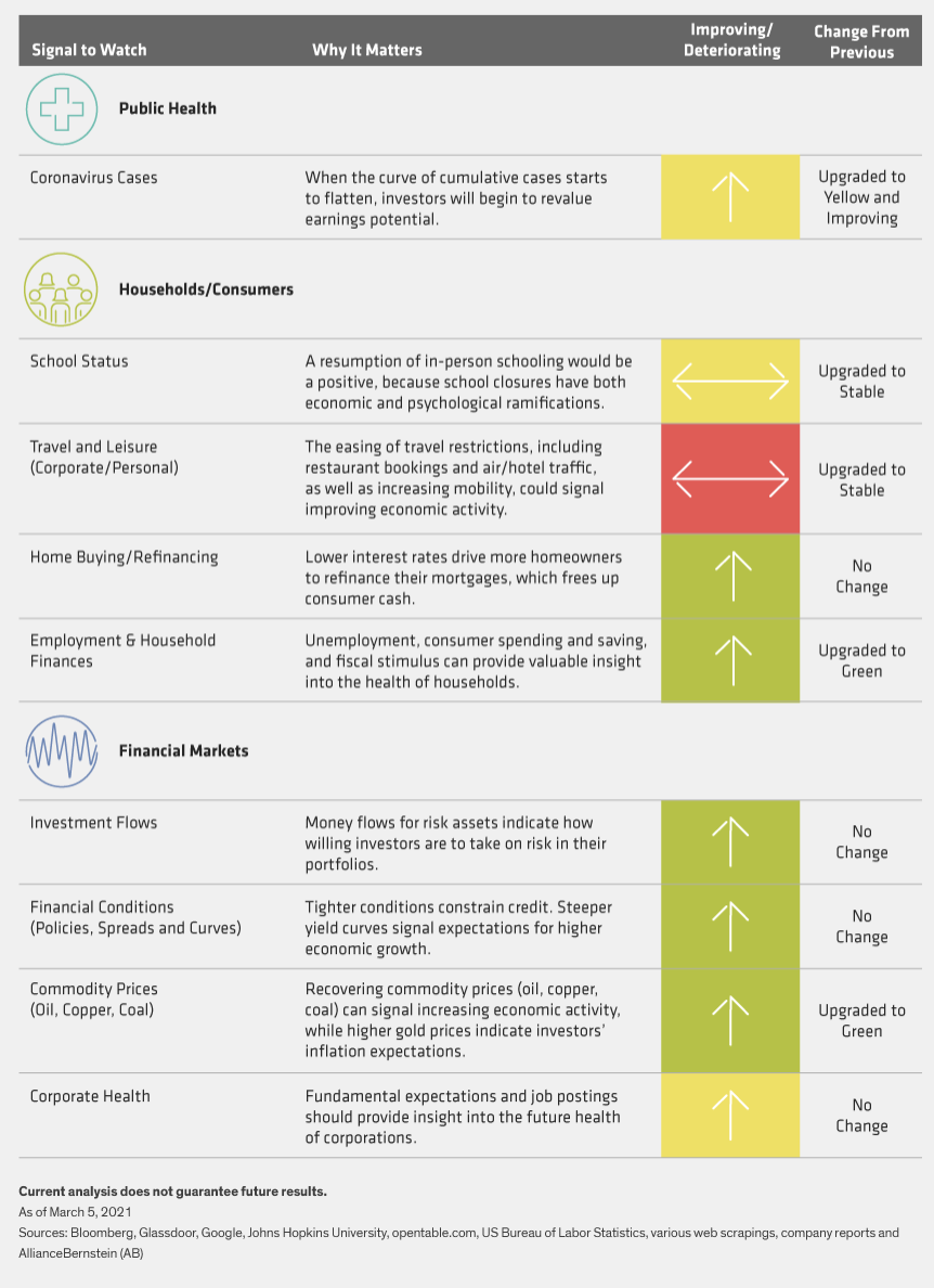
Our crisis dashboard includes signals from three areas: 1) public health, 2) the consumer sector and 3) financial markets. By pulling big data from traditional sources (earnings growth and gross domestic product, for example) and nontraditional sources (like Google Trends and Glassdoor), we can create a better mosaic of the road back. Public health, of course, is the key: until vaccines are broadly available, the cascading impact of the virus may continue.
The dashboard color codes (red, yellow or green) indicate the current state of each signal, while the arrows indicate the trend (improving, deteriorating or unchanged).
What’s Changed Since Our Last Update?
The rollout and administration of multiple vaccines has been accelerating as the COVID-19 global case count keeps rising, though the rate of spread has moderated. We’re seeing tentative signs of stabilization in mobility measures, though there’s still a wide variance regionally. In the US, the wait continues for a massive congressional stimulus bill, which would provide needed relief and put another shoulder behind household finances and the economy.
Public Health
- Globally, the number of confirmed COVID-19 cases—currently about 116 million—continues to rise, with deaths recently topping 2.5 million. More than 500,000 of those deaths occurred in the US. Vaccine distribution has been accelerating, with about 20% of people in the US having received at least one vaccine dose. Fully vaccinated people account for more than 5% of the US population.
- The R0, which tracks the average cases spread by one person, has been declining and is currently around 0.9 globally. The US number remains around 0.9, down meaningfully from a month ago, while the R0 has been increasing and remains elevated in other nations, such as India at 1.1.
- US hospitalizations have declined considerably to an estimated 54,000, down from their peak of 130,000 in early January.
Home Buying/Refinancing:
- Existing home sales have continued at a strong pace, up 23.7% year-over-year in January as lasting work-from-home arrangements require more space. However, the number of people searching for mortgages has tapered off and is now flat year over year.
- Refinancing activity has slowed in recent weeks as long-term interest rates have risen.
Employment & Household Finances:
- US initial jobless claims have declined to their lowest level since the pandemic began, though 80 million people have filed for unemployment benefits since mid-March 2020. The US unemployment rate declined to 6.2% in February, as the US economic environment continues to improve.
- In the US, job postings have improved from the end of 2020, now up 14% from where they were a year ago. That contrasts with some countries, such as the UK, which remains down 33%.
- In late February, the US House of Representatives passed a new $1.9 trillion stimulus package, which included an additional $1,400 in stimulus payments for individuals, extended unemployment benefits and other relief. The bill will now go to the Senate and, if passed, would provide much needed support for those in need and help spur an acceleration in US economic growth.
Financial Markets
Investment Flows:
- Based on Simfund data, bond fund inflows continue—about $64 billion over the four weeks ended February 17. Investor optimism has continued to drive massive equity flows, with $92 billion in net inflows over the past four weeks.
- According to The Investment Company Institute, money-market fund assets remain elevated at around $4.4 trillion, down from a peak of $4.8 trillion in mid-May. Cash holdings have been increasing modestly in recent weeks, suggesting investors may be taking gains amid ongoing market volatility.
Financial Conditions (Policies, Spreads and Curves):
- High-yield spreads have continued to tighten, from over 400 basis points at the end of November to about 326 basis points as of March 4, based on the average option-adjusted yield spread of the Bloomberg Barclays US Corporate High Yield Index.
- The 10-year US Treasury yield rose sharply in late February, at one point exceeding 1.6%, and now remains just under 1.6%. Investors have begun to price in higher inflation and a reacceleration of US economic growth as vaccine distribution promotes normalizing activity.
Commodity Prices:
- Oil prices ground higher for much of February, with West Texas Intermediate Crude trading at approximately $66 per barrel as of March 5.
- Bitcoin’s rally has continued, with the price nearing almost $60,000 at one point in February before retracing to about $48,000 through March 5.
Corporate Health:
- Based on the Bloomberg consensus, earnings estimates have crept higher in recent weeks, with the S&P 500 now expected to deliver 2021 earnings-per-share of $172, a marked improvement from 2020. The same trend is true globally, with the MSCI World Index expected to deliver $132. That outcome would leave US stocks trading at about 22 times earnings and global stocks at about 20.6 times.
Scott Krauthamer is Global Head of Product Management and Strategy at AB. Jonathan Berkow is Senior Quantitative Research Analyst and Alternative Data Lead for Equities at AB.
The views expressed herein do not constitute research, investment advice or trade recommendations and do not necessarily represent the views of all AB portfolio-management teams. Views are subject to change over time.
© AllianceBernstein
Read more commentaries by AllianceBernstein